[adinserter block=”2″]
There are a ton of ways you can make your pro site stand out online, but your website color scheme is one of the most important.
It’s one of the first things people notice – and when your visitors have an average attention span of (at most) 8.25 seconds, the color palette you use to shade all the buttons, text, and backgrounds of your site is super critical for getting people to stick around.
So whether you’re making your site using a builder like Wix or crafting it with WordPress and a theme like Divi, having a “v yeet” color palate (as the kids would say) is very important (as the adults would say).
How the heck do you go about choosing your website color scheme?
Well, it all starts with this here post…
What is a color scheme?
First a quick definition from our friends at Wikipedia (well, we like them; they probably don’t know we exist tbh):
“In color theory, a color scheme is the choice of colors used in design for a range of media.”
In less formal, wiki-style terms: a color scheme (or color palette) is the set of colors you use on your site to create your own unique style and appeal to your visitors.
Types of color schemes
Technically, a color scheme could be any number of colors in any combination – just two shades of blue to every color of the rainbow (heart eyes emoji).
But because some colors look amazing together and others are very wtf, you’ll typically find a website’s color scheme follows one of a few “color harmony” rules.
Analogous
Analogous color schemes use colors that are next to each other on the color wheel (that thing we all learned about in 1st-grade art class – thanks Ms. Zelwiger, hope you finally found a husband!).
Because the colors are all pretty close to one another, websites with Analogous color schemes are versatile and comfortable – but you’ll want to make sure you have enough contrast between different website elements so that things don’t turn into a jumbled mess.
How do you do that?
Use one color as your primary, dominant color used for more important pieces of your site, another color as your main support, and the third, fourth, fifth colors just as accents on smaller pieces.
Monochromatic
If you’re active enough on Insta, or you’re really into grammar/Latin, you probably know that “monochrome” means “one color” – usually black and white.
BUT monochrome color schemes can technically be based on any one hue (red/blue/yellow/etc) in combination with 2 or more shades, tones, and tints.
On the plus side, websites that use a monochrome color palette have a simple feel and are hard to mess up by using clashing color combinations.
But using one color for your whole site can make it harder to evoke an emotional response in your visitors that gets and keeps them interested.
And you can have problems with elements like text, buttons, etc. blending together.
So you’ll have to be careful about your use of other website design elements like layout and typography to keep things interesting and understandable.
Triadic
Triadic website color schemes use 3 colors (which you grammar nerds will know because the Latin prefix “tri-” means “three”) that are evenly spaced around the color wheel.
This means your colors will have a good amount of contrast with each other, but not quite as much as a complementary color palette – so you can use these to make a website that pops but not too much.
Complementary
This is the one we all remember from grade school – complementary color schemes use colors that are opposite one another on the color wheel.
Using a complementary color palette on your website can make for a site that really stands out because of the color contrast, but you’ll want to be careful with how you use your colors.
If you go too crazy with them, your site can quickly become super stressful to look at (for example, don’t use green text on a red background; no one loves Christmas that much).
Compound
Compound or “split-complementary” color schemes as some design geeks call them use two colors adjacent to your primary color’s complementary color.
It’s a solid choice for beginner web designers because you can get the same kind of visual contrast and interest, but there’s less tension between the colors so it’s harder to make a site that wigs visitors out.
Why are website color schemes important?
Whether you notice it as you’re scrolling through Insta, searching through Amazon, or endlessly clicking the next video in Youtube recommends, colors have a major impact on how we feel – on the web and in the real world.
Example: science has shown red and yellow increase heart rate.
So choosing the perfect color palette for your website color scheme is more than just an “I like blue” or “looks good enough for me” kinda thing.
But before we dive into how to choose the best color combination for your site, let’s look at a few reasons why all that work is important in the first place.
#1: Color helps boost brand recognition (and that’s important)
If you were to picture Starbucks, what do you see?
Those Trenta Triple Caramel Macchiato you “occasionally” drink too late at night might be it.
But it’s more likely you saw the iconic green circle with the fancy fish lady in it.
It’s hard to imagine Starbucks without seeing “Starbucks Green,” and that’s the point!
That color serves two purposes for the coffee giant:
- It’s a simple, distinctive color that helps them stand out from the crowd and helps you remember them
- The color itself is calming and associates them with health and wellness (even though we all know mainlining their coffee as we do is not doctor recommended).
Picking a website color palette is about more than just looking cool – it’s a key part of creating your brand and selling any products or services you’ll offer through your site.
According to research by online marketing master Neil Patel:
- 85% of shoppers say color is a primary reason they buy products.
- Color increases brand recognition by 80% (and people are more likely to trust and visit sites with brands they trust).

And according to a study from Northumbria and Sheffield Universities (they’re in the old UK so they must be solid… always trust a British accent/research we always say!), website first impressions are 94% design-related.
And color is obviously a huge part of web design (which is why we’re talking about it!).
It’s 100% essential that your site makes a solid first impression with people, one that’s memorable enough that they return to your site whether you want to sell them something helpful or just share more interesting and valuable insights (kind of like we do here!).
That’s key reason numero uno it’s important to have a mind-blowingly awesome website color scheme.
#2: Color affects how people feel about your site
Research from the University of Winnipeg (that’s in Canada for those keeping track of our research world tour) found two important things related to website color schemes:
- People make their initial judgments of a website/business/product within the first 90 seconds of their first interaction.
- 62-90% of that initial judgment is based on color.
Which makes sense: color is one of the easiest pieces of information to “understand.”
Your brain can sense and evaluate things based on color almost instantly, while things like images, words, and ease of interaction take more time and clicking/scrolling around to process.
So how do you use color to your advantage to make people more likely to come back to your site again and again?
By leveraging the power of (echoey voice) “The Psychology of Color.”
What do colors mean?
That’s right kids, there’s a whole field of science dedicated to studying how colors affect our behavior.
Through loads of not-so-top-secret experiments and research, it’s been proven that colors do, in fact, make us feel things.
And when it comes to creating pro websites, that means you’d best pick a website color palette that makes them feel the kind of feels you want them to feel based on your site’s purpose.
But how in the holy heck do you do that?
Well, it starts with knowing what feelings each color makes feelers feel (we’ll stop after this, promise).
Here’s the low-down:
Black
To get it out of the way for those of you who remember 1st-grade art class: yes, black is a color; no, black is not a color.
For our purposes here, though, it’s lumped in the “color” section of the website design tools and that’s good enough for us.
Black is the strongest neutral color (which also includes gray, white, and brown) and represents power, sophistication, luxury, and formality.
Because it’s both neutral and powerful, the impression black can make varies a lot depending on how you use it on your site.
When used as more than just an accent or text color, it can lend a sense of elegance or edginess to your website design.
Depending on the other colors you combine it with, it can also give your site a conservative/traditional or unconventional/modern feeling, as well as senses of sophistication and mystery.
Gray
Gray is another neutral color, which gives sites that use gray a sense of seriousness, precision, control and lack of emotion…
Which can be a good thing on sites meant for technology, banking, legal services, etc.
Gray can also lend a sense of sophistication to your site when you substitute dark grays for places you would otherwise use black, or light grays in places you would have used white.
White
White is the color of purity, cleanliness, newness, and simplicity, which makes it great for healthcare, charity, and technology sites in particular.
Though obviously it’s kind of a default background color for a ton of other kinds of sites on the web because it works well with just about any other color(s).
Brown
Brown is obviously a natural color (dirt and trees and stones and such).
Because of that, it’s typically associated with dependability, earthiness, and reliability.
When used as a replacement for black, white, or gray in backgrounds, it brings a feeling of warmth and wholesomeness to your web designs.
Blue
Blue is a super flexible color – how light or dark the blue you use can change its meaning a good bit.
Dark blues are considered strong and reliable, while light blues are calming and friendly, and really bright blues are refreshing and energizing.
Whatever shades of blue you use, it’s a color that’s great for backgrounds and accents, though it shouldn’t be used for text as it’s hard to read.
Green
Green can represent a lot of things: new beginnings, growth, wealth, stability, and nature.
In general, greens are calming like blues are but has a bit of the energy of yellow as well, and can help balance out your website designs.
The shade matters here too: Olive greens represent nature, while dark greens tend to represent wealth and bright greens are more energizing.
Yellow
Yellow is the color of sunshine and happiness and hope that the future is a bright one!
Bright yellows are particularly cheerful and good for sites aimed at kids (or parents).
Light yellows are a bit calmer than the brightest yellows, and dark/gold yellows create an antique, “old money” kind of look.
Be careful with this one though: bright yellows, in particular, can be anxiety-provoking and are exhausting to the eyes – so in general, they should only be used as an accent color.
Orange
Oranges are typically associated with energy and creativity as well as fall/the changing seasons/movement in general.
They’re also associated with health because orange is a fruit and doctors like it when you eat fruit.
Orange is bright yet easy on the eyes and more subdued than red, which makes it fairly flexible in web designs.
You can use it as a primary color for backgrounds or as an accent that gets attention without feeling overpowering.
Red
Red is one of the most powerful colors, in part because it’s associated with war and violence as well as love and passion.
Those opposing associations create a lot of emotional tension (see “red can raise your heart rate” above).
Brighter reds give a website color scheme an energetic feeling, while darker ones feel more powerful and elegant.
#PowerfulColorRed can be pretty overwhelming if you use it too much, so in general, we’d recommend you only use it as an accent color when you’re starting out.
Purple
Purple is associated with wealth and royalty because, fun fact/short history lesson, in times past purple dyes for clothes were hard to come by.
Thus, only wealthy, royal people could afford purple-colored stuff (and now it’s the color of a bunch of Pokemon and a Teletubby lol).
In modern times of purple abundance, purple is also associated with creativity and imagination, with darker purples taking on the old wealth/luxury meaning and lighter ones lending a soft, sometimes romantic touch.
How do people respond to color based on gender and age?
Beyond the emotional responses each color makes, color can also affect who finds your site attractive and who doesn’t along on gender and age lines.
Neil Patel also compiled a bunch of data on color preferences by gender and created a super handy color preferences by gender infographic.
Let’s take a look at the highlights:
Favorite and least favorite colors by gender

A couple of key takeaways from that:
- Everyone loves blue, so if that color communicates the information/feelings your site’s aiming for, go wild. Green, red, and black.
- Everyone hates orange and brown, which are also associated with being cheap, so use them more sparingly (in general; if you really love orange go for it; if you really love brown we suggest you rethink your life).
- Women love purple, men not so much (it was 23% of women’s favorite color while no men said it was theirs).
And we can add some layers to that with another piece of that same infographic:
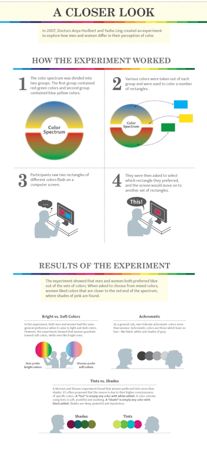
Which shows us:
- Men are way cooler with neutral colors.
- Men prefer darker shades while women prefer lighter tints.
- Men prefer brighter colors while women prefer softer colors.
What about age?
Well we had to dig a bit further on this one, eventually finding that study done by Joe Hallock from back in 2003 (aka “the good old days” aka “the reason why the graphics look so old”).
Favorite and least favorite colors by age
The takeaways:
- Everybody still loves blue.
- Everybody still hates orange and brown.
- Purple seems to become more popular as people get older, while green becomes less.
#3: A good website color palette makes your site feel organized
Choosing the right colors for your website and using them in the right places can also help your website feel more organized (aka “these guys know what they’re doing” aka “this site is really easy to use/understand”).
This happens in two ways:
Establishing visual hierarchy
Visual hierarchy helps people figure out what’s most important, the first thing they should look at on your site.
This can be done in a few ways (99Designs has a great post covering these) and as we know smart cookies like you have guessed, color is one of them.
How does this work?
Well, it all comes back to the emotions and our good old eyeballs.
Bold, bright colors like reds, oranges, and yellows are easy for our eyes to see and that makes them great for things like buttons or sections that have particularly important information.
At the same time, grays, blacks, and colors like blue and purple are emotionally less charged and take our eyes/brains more time to process, so these colors are better for elements like the background that are meant to blend in more or make other elements pop.
Contrast between elements is also important thanks to the Isolation Effect, which is a design psychology principle that says the more an item stands out, the more likely it is to be noticed and remembered.
The use of the Isolation Effect has also been shown in a couple of color studies (this one from U of Berkley and this one from the Journal of Consumer Psychology) to actually be something people prefer in color schemes.
The takeaway: using a website color schemes that include a high-contrast, attention-grabbing color is great for both drawing attention to certain elements and creating a website design people love.
Creating a sense of coherence
A good website color scheme also creates order through coherence.
For example, if you use fire engine red for your “contact us” button on one page, you should use that same color for all the “contact us” buttons on your site.
Or, if you use a blue grid background behind all of your H2 headers (like this post here!), you should use that same color background for all the H2 headers on your site.
A sense of order/coherence is also a factor of the color harmonies/types of color schemes we talked about above.
In this case, using any one of them to choose the set of colors you use in your palette (analogous, monochromatic, complementary, etc), instead of a random mess of colors you like will help your site subconsciously communicate “everything’s organized and tip-top around these parts.”
#4: Choosing a website color scheme makes designing easier
Last on this list but first in our hearts, this is!
Whether you’re building one website and evolving it over time, or you want to build a bunch of sites for yourself or other people (who pay you money!), the less time you spend on basic tasks, the better.
On the color front, you can save yourself a lot of “what color should I use here” time by establishing your website’s color scheme upfront, then applying it anywhere and everywhere you need to.
Especially if you make it into a fancy document like Mailchimp did:
Now, they’ve got a ton of colors in their palette because they have a super complex website/app.
For most of the sites you’ll create, though, we recommend you stick to just 3-5:
- 1 primary color that’s used on the most important elements of your site.
- 1-2 secondary/accent colors that use a little less space on your site and/or are only used on a few elements.
- 1-2 background colors that make your primary and secondary colors really pop.
This way, you’ve only got a few options any time you’ve got to add a page or element to your site.
But how do you choose that top 3-5?
Glad you asked!
[adinserter block=”2″]
How to choose your website color scheme
A good website color scheme is one that finds the perfect balance between two things:
- The brand/business’ values and purpose.
- What your visitors like and want.
Easy enough to say, how the heck is it done?
Whether you’re using Wix or a WordPress theme like Divi, the answer’s the same: 4. Easy. Steps.
1. Know your website’s purpose and audience
Knowing what color palette you should use for your website color scheme will in part come from your instincts and preferences.
But a “pro” website color scheme will start with what the website is all about and who it’s for.
Because that’s how you take the color psychology info we dropped on you above and use it to make the best decisions for your website design!
How do you figure out your site’s purpose?
We’ve got a good bit of info on that in our How to Design a Website guide.
Your goals here:
- Determine what industry your site falls into.
- Determine the values or “personality” you want your site to communicate.
That first part should be relatively simple with a bit of thought:
- Want to sell fitness courses? You’re in the health industry.
- Want to offer the website design skills you’re learning here to clients who will pay? You’re in the marketing industry.
- Want to share stories from your personal travel adventures? You’re in the travel industry.
Etc.
For the second part, let’s use some research to help you pick 1-2 “personalities” you’re aiming to communicate through your site.
Stanford psychology professor Jennifer Aaker’s our go-to for that.
She found that brand personalities fall into one of five core dimensions:
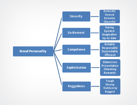
You can maybe mix 2-3 of these types of personality, but it’s best to choose just one to start.
Looking to sell watches on an ecommerce site? Go for “sophistication.”
Want to share tips on camping, hiking, hunting, etc? “Ruggedness” it is!
Maybe you’re sharing your knowledge of a hobby like playing guitar. “Sincerity” might be right for you (could be “EXCITEMENT” too).
The brand personality you go with then ties into the color psychology we discussed above: red could be a good primary color for excitement, black for sophistication, or
How do you figure out your target audience?
Well, if you’re really diligent, you’ll want to do some market research!
A few good resources on that:
- How to Do Market Research for Websites and Blogs
- 10 Cheap and Easy Ways to Perform Ecommerce Market Research
- How to do market research the lean way
To not spend a ton of time learning how to do market research (and actually doing it), you can also just ask yourself a few questions to get started:
- Are you trying to attract younger or older visitors?
- Is your site mostly for men or women?
- What products are services are you selling? Do those attract people who like certain colors or have certain values like sophistication or friendliness?
What colors typically work best for your industry?
A solid shortcut/starting place for choosing the colors in your website’s palette is to look at what other websites with similar goals (aka “in your industry”) usually use.
Because companies offering similar things to the website you’re building are trying to evoke the same kinds of emotions and associations you are, going with their flow is a good place to start.
Lots of visuals from some great research done by other folks here!
First up, an infographic from research done by Towergate Insurance on the most popular brand colors in each industry:

In their study, Towergate analyzed 520 logos in a bunch of industries to figure out which colors each industry favors.
Here we can see blue, red, and green are solid for just about any type of brand/company website.
Now, with industries like “Courier” and “Specialized Chemicals” on this list, you might not find the exact industry your website will be in.
BUT if you think about what those industries are trying to offer and who they’re trying to communicate with, you can probably figure out where there are overlaps with your goals and theirs.
To help you out, though, we’ve got another similar infographic from marketing software company Marketo:

Loads of good info in there so take some time to digest it!
Finally, here’s another helpful snippet from a Neil Patel infographic on how colors affect particular kinds of buyers:

Now there aren’t many colors on that chart and we’re not saying you should use those exactly.
Instead, here’s what it tells us:
- If you’re planning to sell relatively cheap, easy to say yes to products on your site, darker colors, reds, oranges, blues, and blacks are good choices.
- If you’re looking to appeal to budget-conscious shoppers, blues and greens are good.
- If you’re looking to get sales from “traditional” (aka “older”) people, lighter tints like pink and sky blue work well.
Now you’re probably wondering: “if I use the same colors as other companies/websites like mine, won’t it be impossible to stand out?”
Well, that’s where choosing particular colors (like seafoam green in the “green” family) and putting together a unique color palette comes in.
Which leads us nicely into…
2. Choose your primary/dominant color
The primary or dominant color in your website color palette is the anchor for your brand, evoking the main emotions and ideas that you want your website to communicate.
Think “red” and Coca-Cola, “green” and Starbucks, “yellow” and McDonald’s.
If you’ve already made a logo, the color that stands out the most is probably the primary color for your website – so this part’s done!
If you don’t already have a logo or don’t have a dominant color in mind, a good place to start is this handy quiz from Grasshopper, which will help you learn whether blue, red, orange, etc is the best part of the color spectrum for you to choose your primary color from.
If the color that bad boy spits out jives with your preferences and all the color psychology we shared above, awesome.
Look for that color using the two options we’ve got for you below.
If you don’t agree with the quiz results, then sorry we wasted your 2 minutes lol.
Option 1: Get some inspiration
The first method for finding the primary color in your website color palette is to spend some time looking at examples of sites and color schemes you like.
Just visit the sites below to find color scheme examples you like:
When you find a color you really love, you’ll just need to grab and save its hex code, which you can do using the ColorZilla Chrome extension/Firefox addon to snag it.
You’ll need that hex code to use in website builders or WordPress to color different elements.
Option 2: Use a photo
You can also use Adobe Color to extract colors from an image (which could be a photo of something in the real world, a graphic you found online, or a screenshot of a website you like).
Simply upload a photo to their tool under the “Extract from an image” tab, then you can choose different color palettes based on various moods using the left sidebar.
When you find the set you like best, click back over to the “Color Wheel” tab to copy one of the color codes to use as your primary color.
Or you could just use the complete set as your entire website color scheme!
How to use your primary color on your site
Once you’ve chosen your primary color, where the heck do you put it?
Definitely not all over your site; it’ll make your design overwhelming.
Generally, you’ll want to use your dominant color in the key places you want to draw attention to (like contact us buttons, key information, and your logo):
3. Choose your secondary/accent colors
Once you’ve got your primary color picked, figuring out your website color scheme is a downhill trip.
The next step is to pick your secondary and/or accent colors, which we’ll base off the first.
As we mentioned above, some sites like MailChimp have a ton of colors in their website palette because they make a very complicated web app.
For the rest of us, one primary color plus 1-2 secondary colors is plenty.
How the heck do you figure those out?
By using the color theory harmony rules we mentioned above!
No need to whip out your own color wheel and protractor (to figure out the right angles), Adobe Color once again has our backs.
How to choose your secondary colors using Adobe Color
First, pop on over to their site using this link, then paste the hex code of your primary color in the first box.
By default, Adobe’s gonna show you other colors using the “analogous” harmony method.
For our website design purposes, though, we recommend you choose either Triad, Complementary, or Compound using the sidebar, as these will give you a set of colors that are the easiest to use on a website (aka “it’s harder to f*ck up your web design when you’re still a beginner”).
Note: when you pick a new color harmony rule, you’ll have to re-enter your primary color’s hex code.
As you’re looking at the various options, you can also play with the little circles on the wheel, dragging any of your colors in and out, side to side to change the hue and brightness/darkness.
You can do the same with the sliders under each color.
And you can click the color boxes to change which is your “base” aka “primary” color.
No worries about messing things up doing this: Adobe will make sure it still applies the color harmony to any changes you make, though it will change the primary color/hex code for the primary color.
If you like the new color, though, go with that instead of your original!
As you’re playing around, you’ll be given 4 potential secondary colors (in addition to your base/primary).
You can use all of them if you like, but if you’re going to stick to our “keep it simple with 1-2 accent colors” rule, you’ll want to do this: make sure your base color is in the far left box (you can drag it over there if it’s not), then use that, the middle/3rd color, and the last/5th color.
The 2nd and 4th colors are generally for more complicated designs.
With your secondary colors found, be sure to copy those hex codes to the same place you have your primary color for use on your website.
Speaking of which…
How to use your secondary color(s) on your site
You’ll want to use your secondary/accent colors to highlight less important information/elements like subheadings, active menu items, and content that’s only useful for some of your users.
Aka “things you want to stand out but not too much.”
Here’s how accent colors are used in our website color palette example:
4. Choose your background colors
Your background colors are going to fill in the spaces where you don’t want to use your primary/secondary colors, like text, the background of blog posts, etc.
Now, typically the safe bet is to just use black/white/gray for these, as they’ll help keep people focused on places you’ve used your other colors and won’t break the color harmony we worked so hard to get playing around with Adobe’s tool.
If you want to just use neutrals, head back to the Color tool, chose the “shades” color harmony, then type “FFFFFF” into the first box (which is the hex code for pure white).
You can then drag the very bottom slider under that box around to use a slightly gray version of white as your base or click one of the other colors to make it your base to play around until you get a “basically white,” “basically gray,” and “basically black” set of colors to use in your backgrounds.
Depending on your site’s purpose, though, you might want to get a bit fancier than that…
Ecommerce or content-heavy site? Stick with neutrals
Sites that sell a lot of products (aka Amazon) or are mostly about sharing information and ideas (aka blogs like this ‘un ‘ere) want to put as much focus on those products/words as possible.
So it’s best to use neutral color backgrounds so that these pop as much as possible.
Business-focused website? You could use shades of your primary color
Because color is an important part of branding (like we talked about above), if your website is primarily about sharing background info on a business or charity (while maybe sharing information about services clients can pay for), you can use shades of your primary color for backgrounds.
This will really help plant your brand color into your visitors’ minds to make it more recognizable/memorable.
Neutrals are always the safest, but if you want to have a more colorful set of background colors, use the “Shade” harmony in the Adobe Color tool, put your primary color in, and you’ll get a set of background colors you can use that should look good together.
Just be sure to use more subdued shades, nothing too bright or bold, as you’ll still want people to mostly focus on your content/sections where you use your primary and secondary colors.
Going for super stylish? You can use some graphics/images too
If you’re building a site in the restaurant, fashion, beauty, or creative industries, using a lot of images or graphics in your backgrounds can create a super-premium, very stylish feel.
Just be sure of two things:
- That your text is still readable.
- That your design doesn’t feel like there’s too much to look at because of all the details in your backgrounds.
Part of that will come from choosing images/graphics that don’t have too many elements in them.
But you can also use the “Shades” harmony in Adobe color to find either neutral color shades or shades of your primary color to overlay on your images and make them more subdued (you can either add overlays to the images themselves in Photoshop or in your website builder/Wordpress).
[adinserter block=”2″]
Website color scheme examples
When you’re starting out, it can be tough to come up with design ideas on your own.
Which is where a little inspiration from great designs comes in!
So to help you get started with a few ideas for your own website color scheme, here are a few great schemes and designs from around the web.
A lot of these sites are custom coded by teams of pro web designers, but if you find things you like in one and want to replicate them on your own site your best bet will be to use a website builder like Wix or, if you’re going WordPress, using a WP drag and drop theme builder like Divi.
Either one of those will let you get pretty damn close to anything you see below – without having to learn a lick of code!
1. Fun and Playful
#b200f8 #ff4247 #ffdb6c #00545a #002835
Somewhere between a softer and brighter palette, Flatiron showcases a diverse color combination that creates a fun and playful vibe. The colors are featured in animations and used as font colors, in icons and graphics and other creative ways.
2. Strong and Sleek
#8a211b #b3925f #f0cd95 #001446 #eaeae2
Featuring a bold, darker tone throughout its site with a midnight blue background, Martell breaks away from the traditional, cookie-cutter designs you see so often on the market. Shades of gold and dark red accent colors provide a stunning contrast to the prominently dark color palette.
3. Corporate and Creative
#e9467d #113b77 #2565c7 #4bb3f0 #e9e9f3
NetNation introduces a corporate-style website design that uses multiple shades of blue, a color that emits trust and professionalism to its viewers. The magenta color you see used in icons adds a pop of playfulness to the very corporate design.
And other graphical elements create a contrast that breaks up the mostly blue palette.
4. Natural and Enchanting
#fdc3b7 #f3d982 #a7dac9 #5178b1 #e7f4fd
Pastel, earthy colors produce a playful, natural, and somewhat enchanting look that directly correlates with the company’s core mission. A featured landing page on the New York Times website, this company uses their brand colors in pretty creative ways throughout the page.
5. Vibrant and Energetic
#eeeeee #cc5245 #58a9a5 #f3d33b #231f20
This co-working space and start-up incubator, located in Canada, uses lively colors that are intentionally vibrant and meant to evoke creativity and inspire the viewer. Overall, they do a great job using four or five distinct colors in different ways throughout their site.
6. Powerful and Poised
#4A174B #5BB77E #56C6F0 #E1405A #ECB230
Slack is a leading enterprise chat app used by millions of people. They’ve invested millions of dollars into perfecting their branding and it shows.
Their bold-and-bright color palette uses dark plum as its base color, which draws the user in and exudes power and independence.
With energetic accent colors, Slack does a great job pulling in the viewer using color theory.
7. Bold and Happy
#FFFFFF #000000 #E93F33 #FEE533 #4F5CD6
With a strong 1950’s comic book-style design, The Happy Hero chose bold colors for their website including sunflower yellow, fire engine red, and pacific blue. Their goal is to spread happiness and their design reflects this mission well.
8. Calming and Earthy
#BEBDAA #F6EEE2 #D4D8CE #B29578 #000000
Topes, browns, and soft green colors are featured in the design for Titya Ravy’s website. A fine jewelry maker, Titya chose a very non-traditional color palette to showcase her brand.
The earth tones she uses are reminiscent of the natural materials she uses in her jewelry designs.
9. Clean and Bubbly
#E94734 #334F6E #FFFFFF #F8F8F8 #F9DFDB
The UMAN website may seem to feature a less sophisticated color palette compared to other examples we’ve seen so far, but sometimes, simple is better.
A professional services company offering retirement and life planning services, Uman’s clean and simple design uses a combination of mid-tone blues, salmon, and red to exude professionalism and urgency.
10. Bright and Playful
#7a00f8 #ff003e #f39190 #f3e513 #00bfd2
Whoa, Mama is a suitable title for the color palette featured on this website. Bright and playful with tons of 90’s digital art infusions, Whoa Mama is a gleeful example of branding done right.
Purple, red, yellow, and teal are paired perfectly with each other and featured prominently throughout this epic design.
11. Inviting & Trusting
#56909a #b3d2d7 #aeaf71 #717b44 #df8956
NU is a unique project with a unique goal and uses an equally unique color palette on its website. Many purpose-driven projects use a softer color palette to appear inviting and mission-oriented, and NU is no different.
This compound color palette consists of deep-sea blue, summer sky blue, olive green, soft green, and sunburnt orange.
12. Creative & Professional
#455799 #5f7add #af6ac6 #f09686 #f7be3e
Raise Your Website is an online website testing tool and its website features a creative color palette that uses a unique combination of two complementary blues, along with magenta, peachy orange, and sunset yellow.
This compound color palette brings out a creative yet professional aesthetic that can easily be replicated on your website.
13. Professional & Inviting
#155799 #1d76d1 #0f7ce0 #53c3f6 #e9f2fe
The Access IS site uses a range of blues in their web design color palette, creating an intentionally corporate feel to their site that is inviting and professional.
With tons of custom illustrations that feature the four-tone color palette, Access IS shows us that a monochromatic color palette is not only doable but can work out quite well in website design.
14. Energetic & Playful
#e85db6 #ea5467 #f2af37 #cdf564 #6fd862
As a leader in the music streaming space, Spotify’s bold branding speaks loudly throughout its website design. Spotify has been known to push the boundaries of web design.
This landing page uses 1990’s inspired neon pink, orange, and green color tones splashed throughout its site to create an energetic yet playful color palette that inspires users to download their app.
15. Wise & Illuminating
#ead6b7 #cba978 #9ea3a9 #14222d #e34234
As a financial advisory service, The Ronin Society stands out from other players in the industry with unique sepia-style web design concepts used to create a trusting, professional brand appearance.
Royal gold, navy blue, and fire engine red are used in perfect harmony on Ronin’s site and, together, add a feeling of illumination and wisdom.
16. Familiar & Futuristic
#050c3f #6474b9 #4a2c96 #9b75c5 #70edf0
“Psych” is a digital solutions company, so their futuristic color palette is a good choice, with deep blues and purples featured throughout the site. A bright turquoise accent color breaks up the mostly dark color tones creating a futuristic vibe that’s somewhat familiar.
Purple was a popular web design color in the late 2010’s and will likely continue to be used in many site designs.
17. Earthy & Complementary
#333333 #a5502f #e36f30 #f2bf20 #4b7803
Care is on a mission to combat climate change and its branding and color palette is a perfect representation of their social impact.
With an intentionally earthy color palette filled with oranges, yellows, and complementary colors including mid-tone green and dark brown, this is a perfect example of a complementary color palette done right.
18. Calm & Collected
#deba93 #081521 #001f33 #23628b #53b5c1
This website is calm, cool, and collected. With a dark overtone using several dark blues against a mid-tone aqua color, Slumber’s website breaks from the standard “minimalist” design approach and uses warm illustrations to elevate its branding and showcase their inspiring, analogous color palette.
19. Edgy & Vintage
Indie pop group Mountain Man wastes no time showing the world exactly who they are.
With a naturally-edgy and vintage vibe, this music group’s website uses peachy pink lettering against a yellow-filtered background with other complementary colors such as sage green to create a stunning, dusty, earthy tone on its website.
20. Warm & Comforting
#fffafd #fcf3f7 #f8dbe3 #e94363 #131414
Cowboy is an e-commerce brand and its website design uses four different shades of pink. The monochromatic, all-pink color palette is a bold choice, but one that sells its products with confidence.
Pink is a warm and comforting color that can relay a feeling of hope and alleviates feelings of stress or anger — making it a great option for web design.
21. Simple, Assertive, Historical
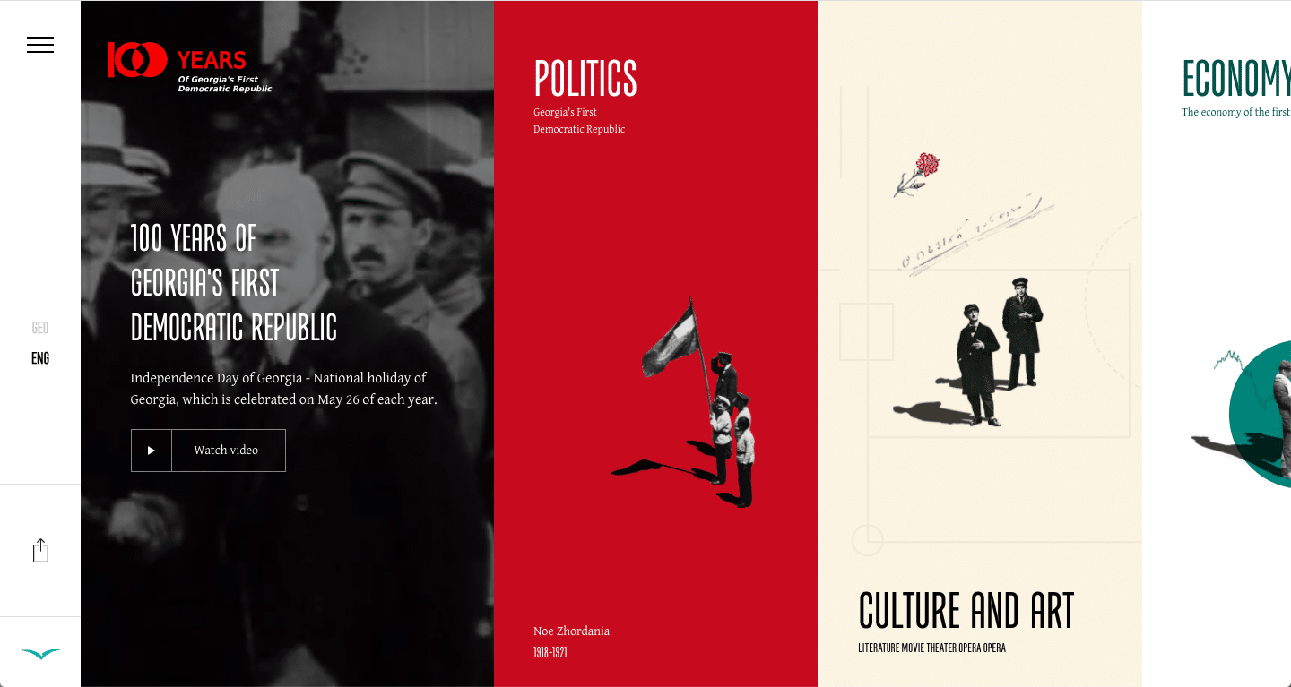
#b63232 #fbf3e4 #397e77 #cf633d #f7c156
The 100 years website uses assertive yet simple colors to take the viewer back to a unique moment in history. The website features a horizontal scroll that helps to create a unique sequence of storytelling. The amalgamation of rich and assertive red, the calming pops of refined emerald green, and the earthy accents of the muted orange and yellow, pair poetically with the minimal simplicity of citrine and white to create a historic carousel that invites you in to discover the many wonders of this website.
22. Rich, Refined, Artistic
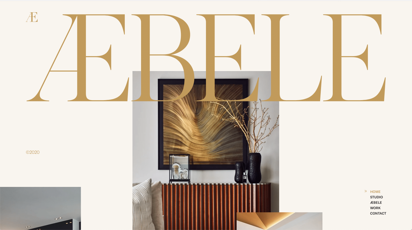
#f9f5ef #c19a5b #1f1f1f
The color scheme used for the Abele interior design website is effortlessly elegant. They used a simple color scheme, consisting of only three colors, to grab the attention of site visitors. Anyone with refined taste will appreciate the rich and artistic creativity that went into designing this website. With colors of gold, soft tan, and deep charcoal, any client looking for luxury can be confident they have found it with Abele Interiors.
23. Professional, Powerful, Trustworthy
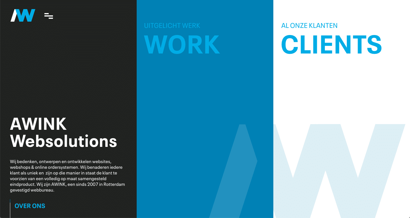
#48aee3 #3181b2 #212221 #ffffff
Awink is a tech company committed to designing unique and incredible websites. Being the proficient web creators they are, they knew not to waste time distracting the user with an overabundance of colors. Two deep shades of blue, muted black, and white was all this website needed to come alive. Simplicity was the key to creating a professional and powerful ascetic that tells the user, “You can trust us with your business”.
24. Edgy, Funky, Vivacious
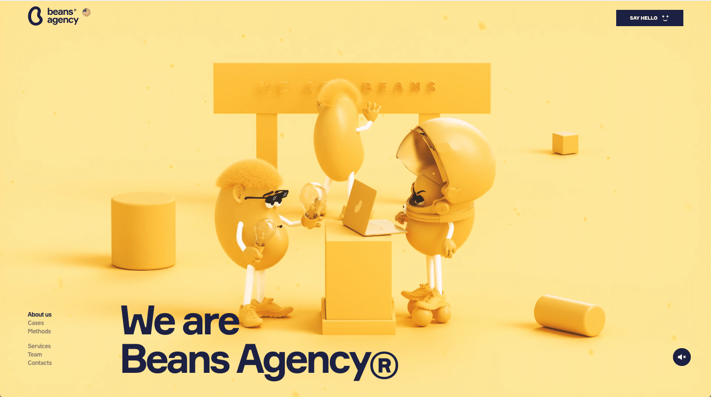
#fdeaa4 #f9ca46 #f8eff1 #f9dcd9 #d78576 #dee8fa #1c2042 #badbe5
The brand agency known as Beans creates an inviting and enticing aesthetic for anyone visiting their site. The bold and rich spectrum of colors, like cape honey yellow, Kournikova gold, dawn, and azalea pink, rose Gold, and three shades of coastal blue make this a sight for sore eyes (get it? site/sight). Anyways, this color scheme was carefully thought out and took the work of a true creative genius which is why it was a must for our list!
25. Fun, Flirty, and Full of Life
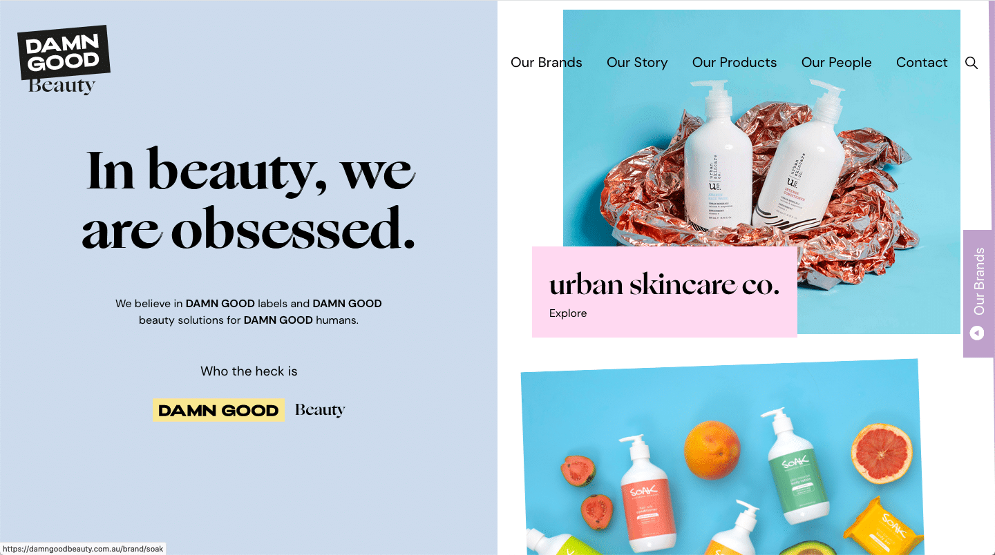
#cfdaeb #b9a3c8 #f9daf0 #f7e79c #c2c2c0
Damn Good Beauty uses a color scheme that pulls in the visitor and showcases their products with some playfulness mixed in with a little spark. With a color scheme consisting mostly of pastels, you can tell Damn Good Beauty does things a little differently than the other beauty and skincare companies on the market. The pastels are light and airy, signifying that their beauty products are the same. This is a great example of how colors can be used to amplify a brand and tell customers exactly what the product is all about.
26. Rich, Modern, Refined
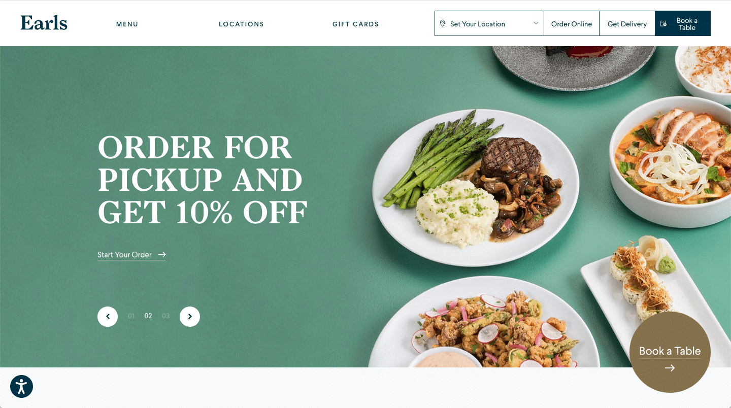
#619481 #85714d #0f344a #3f4751
Earls is an upscale casual restaurant that offers many alluring and delectable plates that would tantalize any tastebud. But our focus isn’t on their culinary expertise. No, we’re more interested in the smorgasbord of colors paired perfectly on their website. Earls uses clean whites, soft hues of blue and deep Cyprus to create a clean and modern perception all while effortlessly combining deep, rich jewel tones, like shadow gold, and jade, taking you back to a certain era of refinement.
27. Masterly, Creative, Advanced

#242441 #dd782f #f4f4f4 #816359 #a25a2b
Etiya has a mission to exceed every day. It promises to be a-head-of-the-curve from other software companies. Much like their pioneering professional capabilities, they equally have an extraordinary color scheme that emanates their ideas. This array of colors used for this site emit a masterful attitude, teeming with creativity, and advanced designs. With such a creative and sophisticated color scheme, it’s no wonder they have our attention.
28. Digital, Quirky, and Innovative
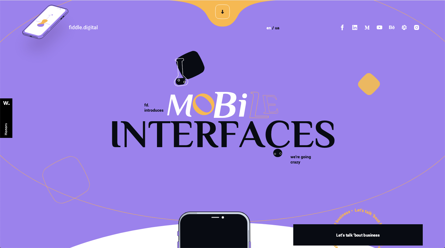
#a872ee #f6b841 #080b13 #ee9572 #d0d8e8 #eb6678
Fiddle Digital uses a vibrant and unconventional purple as their foundational color for this website design. Purple is a bold option that few choose but it’s a great choice to convey imagination and can be creatively used when incorporating a unique color palette. The blend of vibrant colors like amethyst and saffron in contrast to a variety of pinks and blues creates a quirky, yet innovative mix that just works so well. That’s why it had to be on our list of best color schemes for websites — the blend of colors is so crazy that it just works!
29. Monochromatic, Intentional
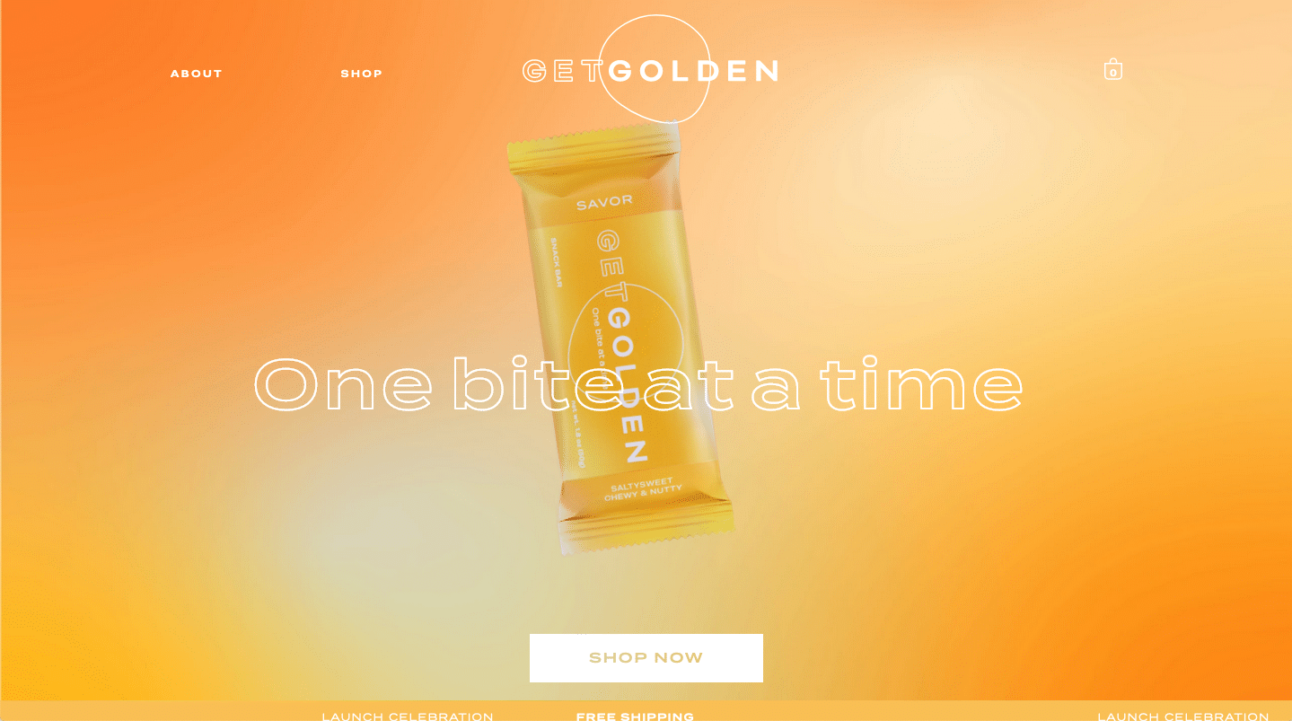
#fff7e2 #fedd87 #f9bf54
The brand is the color scheme and the color scheme is the brand. This may sound like something a tacky marketing agency would pitch to a business to develop their color scheme, but in this case, it’s true (and it works!). This company uses three shades of golden orange to create a monochromatic, on-brand experience that screams “THIS IS OUR BRAND”!
30. Futuristic, Dreamy, Inventive
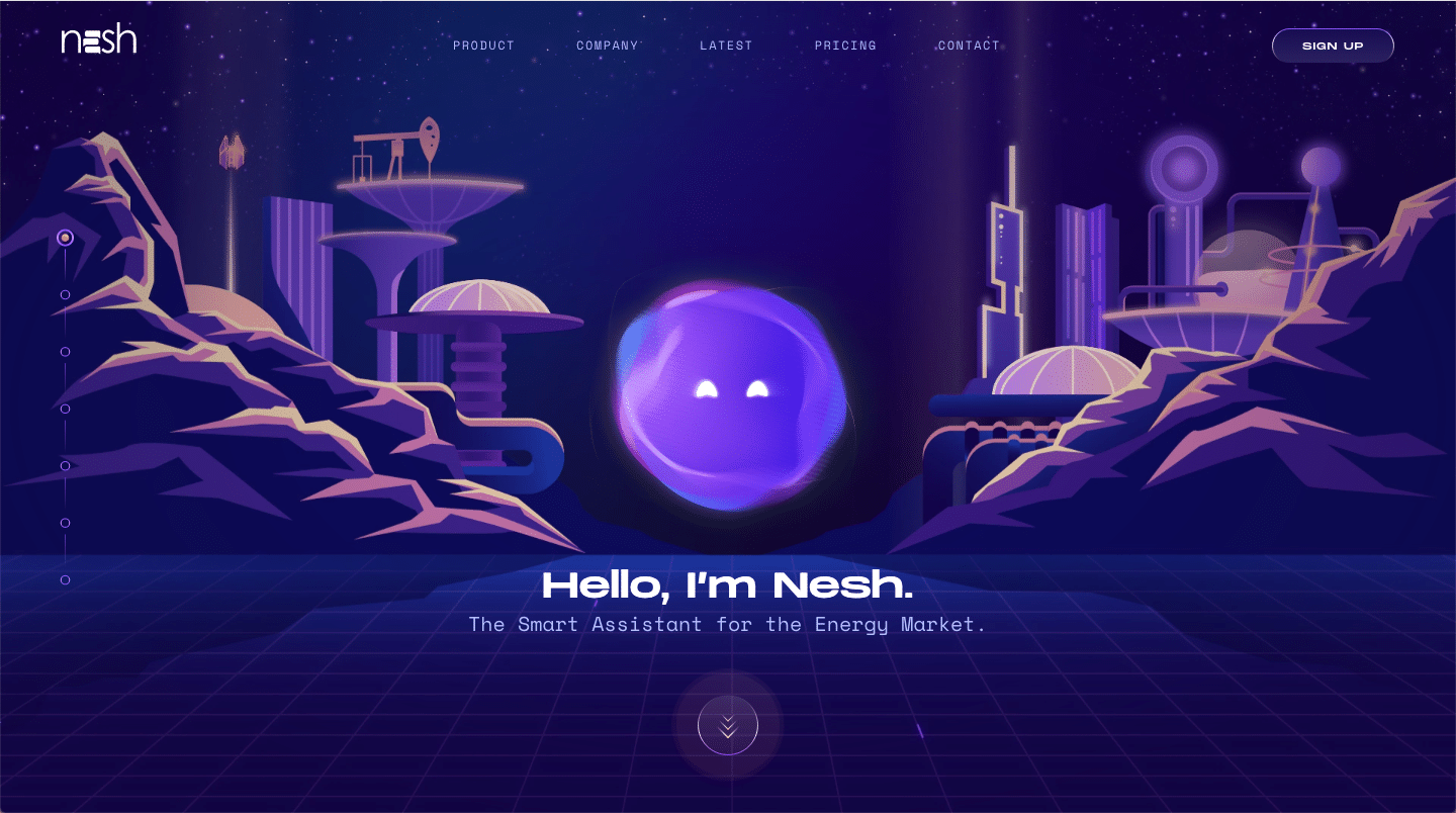
#c9d0fd #804ef6 #f3b3a0 #140d41
Nesh is an AI Assistant for Search and Analytics, designed to find answers to your business questions 10x faster via the power of Natural Language Processing. The Nesh tool was no doubt an out of this world idea and the color scheme they created to go with it speaks to their impressive creative capabilities. deep and dreamy purples like violet and blue ribbon, combine perfectly with the soft periwinkle and mandy pink to create a cosmic and revolutionary website that screams “ I Am The Future”!
31. Bold, Vibrant, Pristine
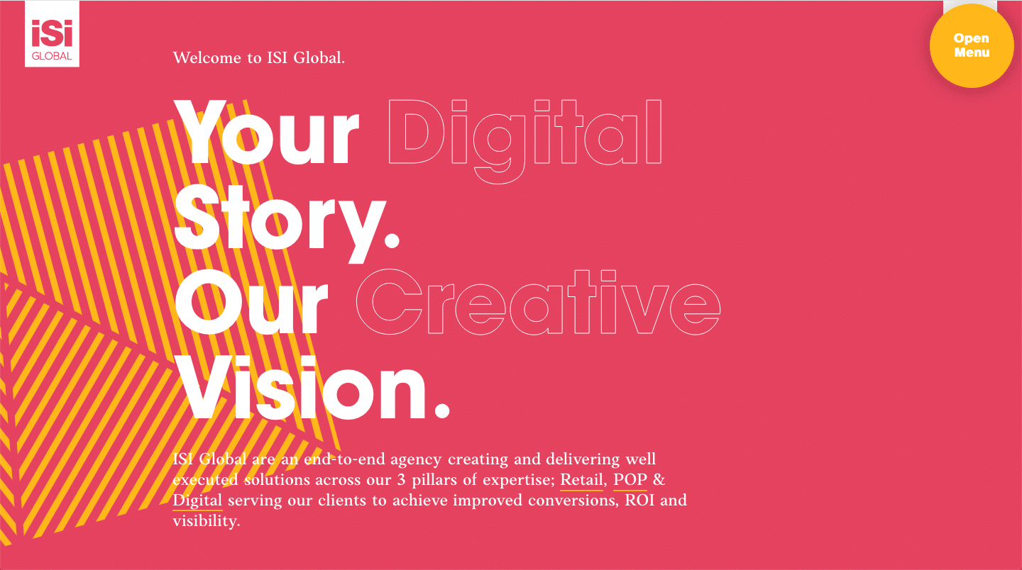
#e54360 #f6b733 #0d2e40 #4da9af
An unlikely combination, iSi Global, pulls out all the bold and wild colors like saffron and cerise, all while managing to create a vibe that is fresh and pristine. this impressive design agency pulls off a look that many can not get away with. Their ability to implement a vibrant color scheme all while maintaining a sense of composure and professionalism speaks to their capabilities as of design agency.
32. Light, Sustainable
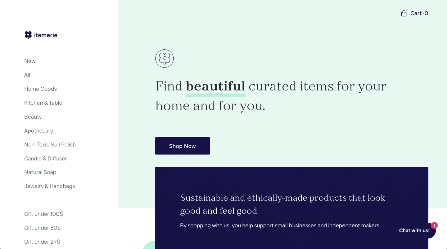
#fff196 #e7f9f0 #eaffad #ffcdff #171447 #f4f5f8
This brand uses light and airy colors as their main color scheme, coupled with a dark, midnight blue contrasting color that portrays a sense of playful sustainability, yet coincides with its mission of curating ethically-sourced products for the home.
33. Unusual, Cohesive

#4bb2e9 #052355 #e2d1cb #a793aa #6adf91
Katch Me uses five, unusually-paired colors to create a color scheme that actually ends up working very well. The five-point color scheme seems contrasting but when used together appears cohesive, bringing together the brand’s voice with its’ style guide, creating a seemingly sharp and well-thought-out brand.
34. Relaxed, Welcoming, Earthy
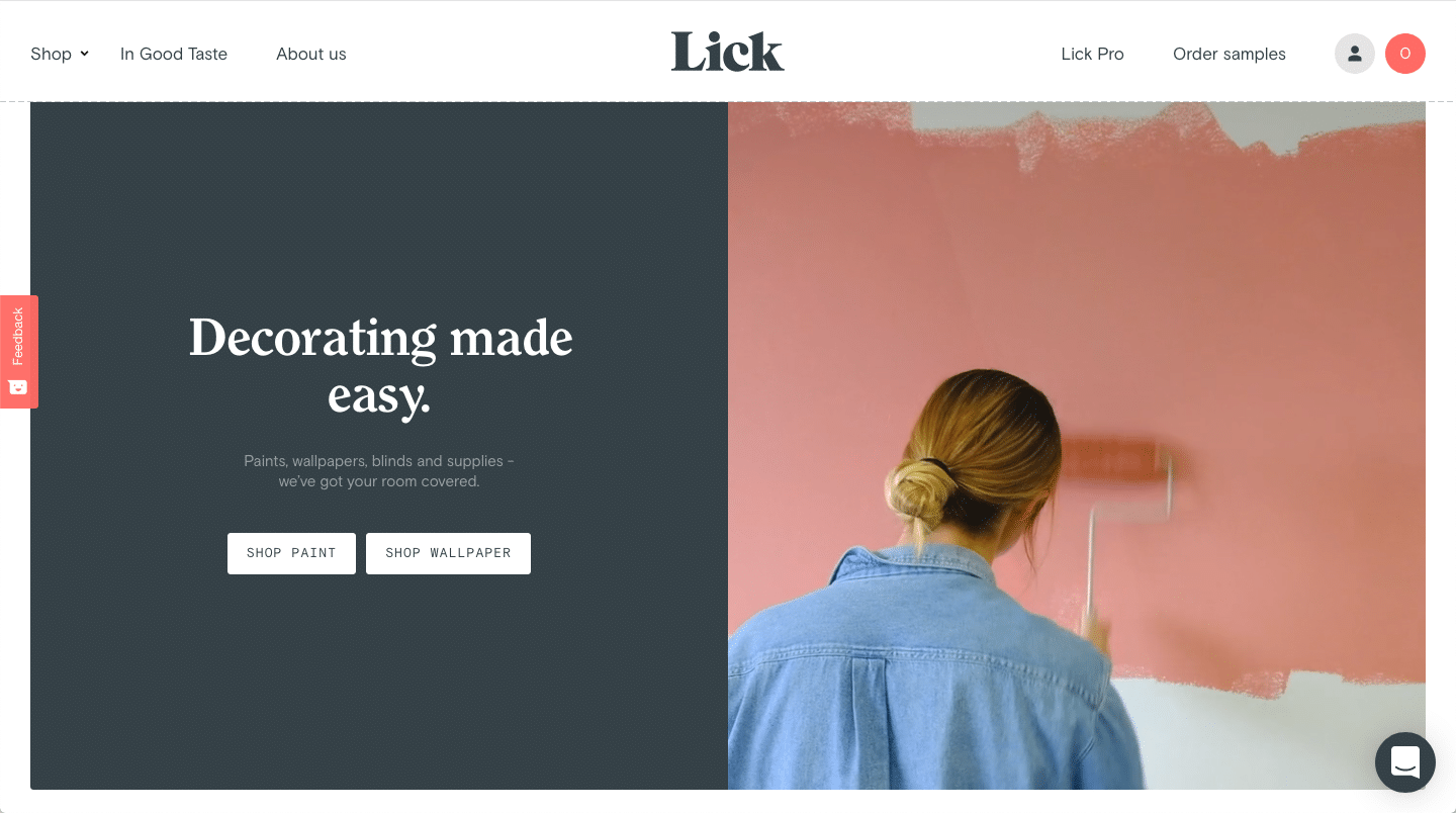
#354147 #a4493e #444a57 #d6a76b #606c62
Lick is bringing us all the warm welcoming vibes you hope your guest feel when they walk into your home. Lick, a website that makes decorating easy and hassle-free for the buyer, has perfectly mirrored the impressions of a comforting, beautifully curated home. They use relaxing earth tones like limed spruce, apple blossom red, wheat field gold, and olive to create a vibe that invites you in to experience the hospitality they so eloquently offer.
35. Big, Bold, Beautiful
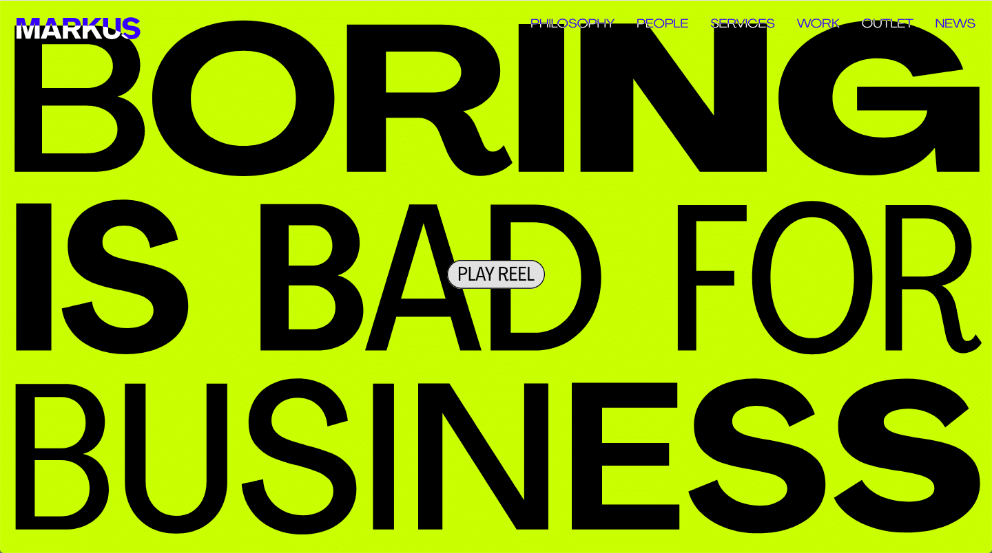
#c8ff00 #e0e0e0 #5301ff #000000
This website uses neon colors paired with dark accents to create a bold and beautiful color scheme that showcases content visually and creates a vivacious and enthusiastic website brand. Their motto is “boring is bad for business”, and I think they really drive that point home with their bright and lively color scheme.
36. Bold, Retro, Edgy
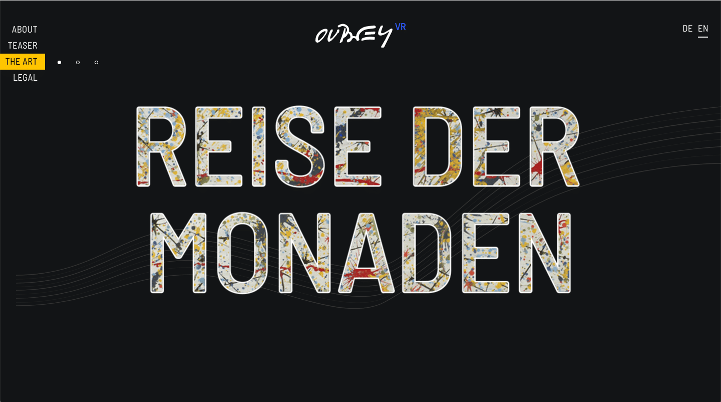
#3060f6 #90539a #e8622a #f7c444 #131516 #000000
Virtual Reality agency “Mindkiss” uses black and dark-gray background colors along with neon accent colors to portray a feeling of digital immersion. The color schemes Mindkiss chose for its website and brand bring back a sense of early arcade-style artwork yet make it work for the modern world. Neon purple, yellow, and blue contrast well with the black background used throughout the site.
37. Peaceful, Earthy, Organic
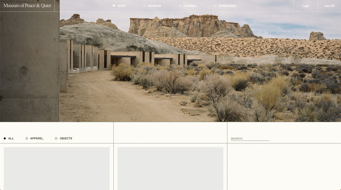
#1f2c16 #757e6d #fDfBf4
The Museum of Peace and Quiet just whispers greatness with its earth-inspired color scheme inviting in feelings of tranquility through the soft, linen white featured color used throughout its website. Camouflage green is used as a background color throughout the site, which pairs well with the dark, black-olive color used for the fonts. If there’s one thing the Museum of Peace and Quiet did right through its website color scheme, it’s exuding the very feelings of peace and quiet they showcase in their museum. Well done!
38. Funky, Fresh

#4d8b2c #c2d553 #2d1051 #282828
A festival and forum based out of Canada, Mutek’s color scheme is anything but traditional. Using two different greens — olive green and Granny Smith Apple green — is a bit of a risk, but the combination triggers a mind-altering daze when side-by-side with the deep purple and dark gray colors used in their color scheme.
39. Refined, Simplistic, Refreshing
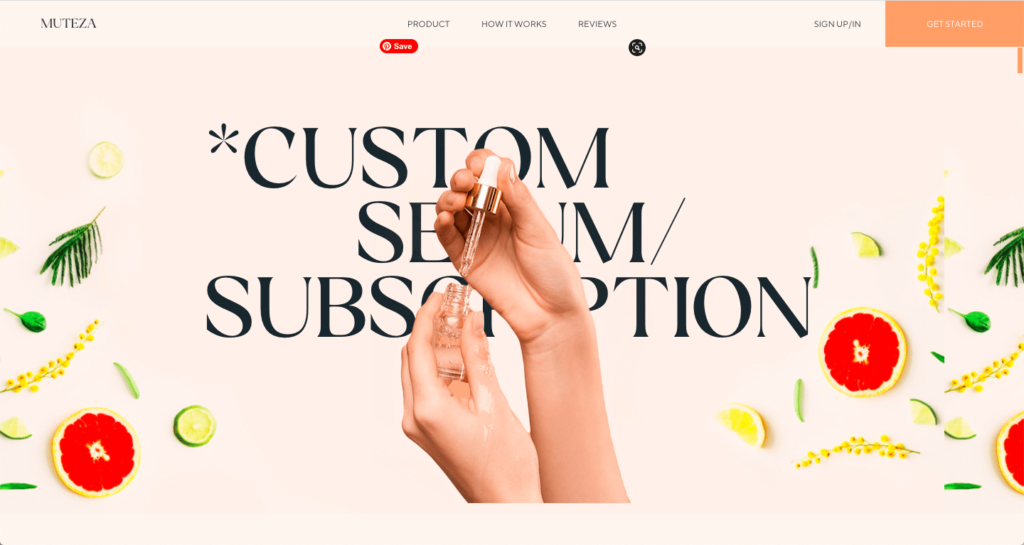
#fdf5f0 #f2a271 #f6cace #1b262c
Muteza takes a fresh new spin on simplicity. Their website offers fresh, organic serums for your skin but the serum isn’t the only thing they are selling. With their sophisticated monochromatic orange color scheme, they offer their customers an experience of leisure, refinement, and freshness. Their choice to use soft charcoal for the text as opposed to a common black was a brilliant alternative that speaks to the organic and natural ambiance of this website.
40. Playful, Trendy, Organic

#e9d4c5 #336b59 #d69e92 #deb99c #fdfaf6
Nutritional Freedom is a company dedicated to helping women ditch their diets and get healthy for good. Their attractive color scheme, consisting mostly of monochromatic natural pinks and beige, with beautifully contrasting pops of amazon green, call to the attention of women (their target market) and relates ideas of organic, clean living and eating. The earth tones and playful style of this website create an on-trend look and feel that encourages the client to trust the advice and intentions of the company.
41. Playful, Predominant
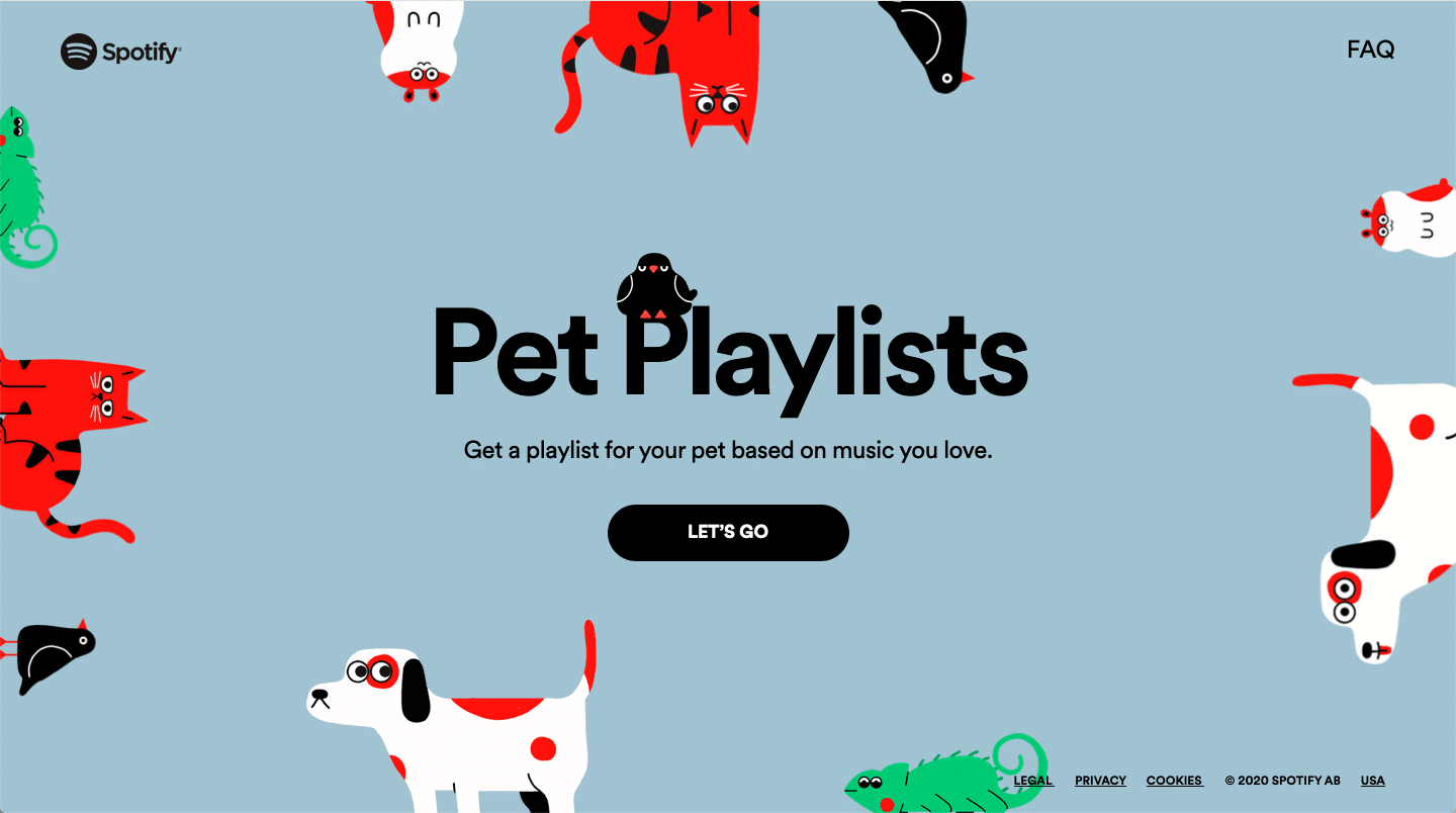
#a0c3d2 #e94236 #61c174 #000000
Spotify has taken its customer connection to the next level by adding a pet playlist feature. Now you can fill out the information about your pet’s personality and Spotify will curate a special playlist specifically for your furry-friend. Their unique and predominant color scheme matches their awesome new concept flawlessly! The rich but muted blue is a perfect choice to off-set the vibrant and deep saturation of red and green. This carefully crafted color scheme reflects the playful intentions of this clever Spotify creation and we could not be more about it!
42. Imaginative, Minimalistic
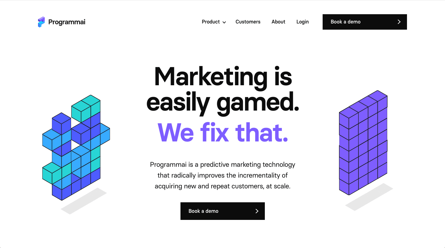
#7e5dfc #64d5d6 #4f5cfc #3faafb
This website offers up a clean and simple look, stripping away any unnecessary fluff. It uses a minimalistic style with apparent pops of purple and shades of blue, showing their creative side and drawing the user into the important features of their website. This simple yet carefully thought-out color scheme helps to ensure the client can feel confident using the companies marketing services.
43. Elegant, Classic, Modern
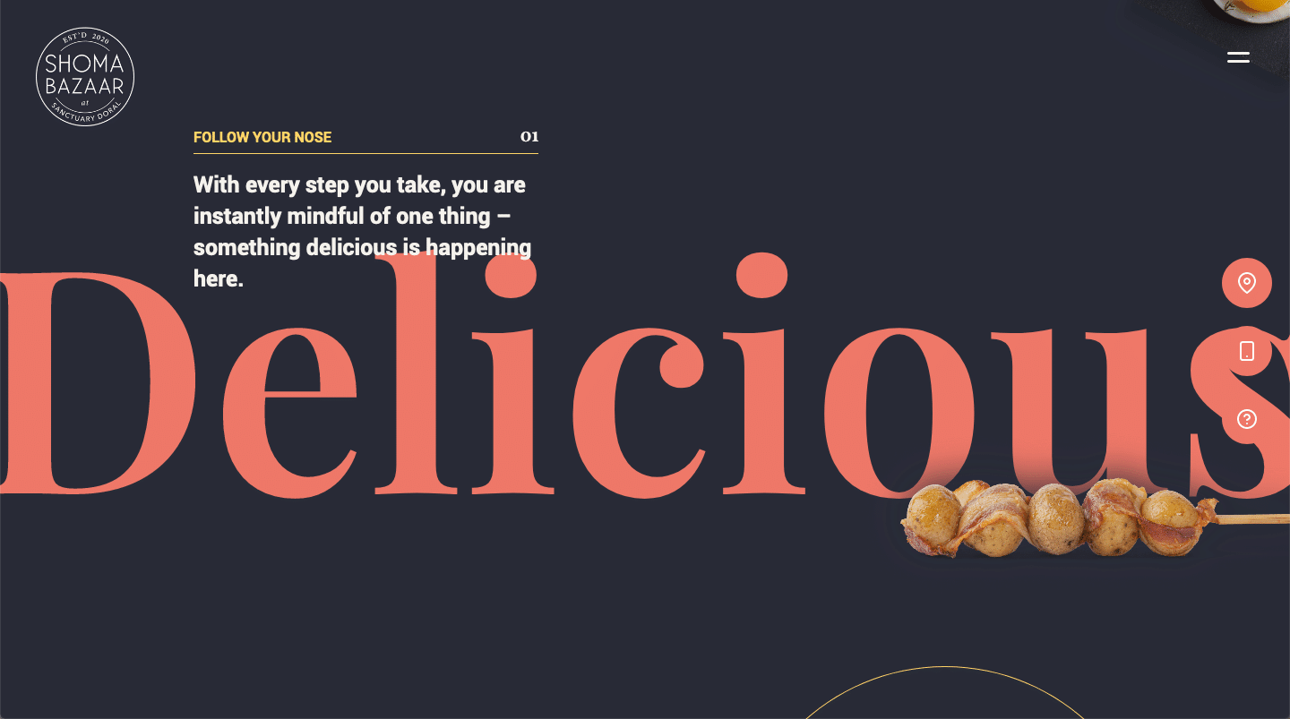
#fad565 #ed7768 #292b37 #ab7c68
“Classic” and “Modern” don’t usually play well with each other, but Shoma Bazaar certainly knows how to create an elegant color scheme that just feels good. The dark charade charcoal color offers a backdrop to the goldenrod and burnt sienna colors that contrast well and excite the soul. As a culinary market, the dark-colored backgrounds offer a perfect canvas for showcasing their photos throughout the site which brings together the brand’s elegant, classic, yet modern look.
44. Thoughtful, Whimsical
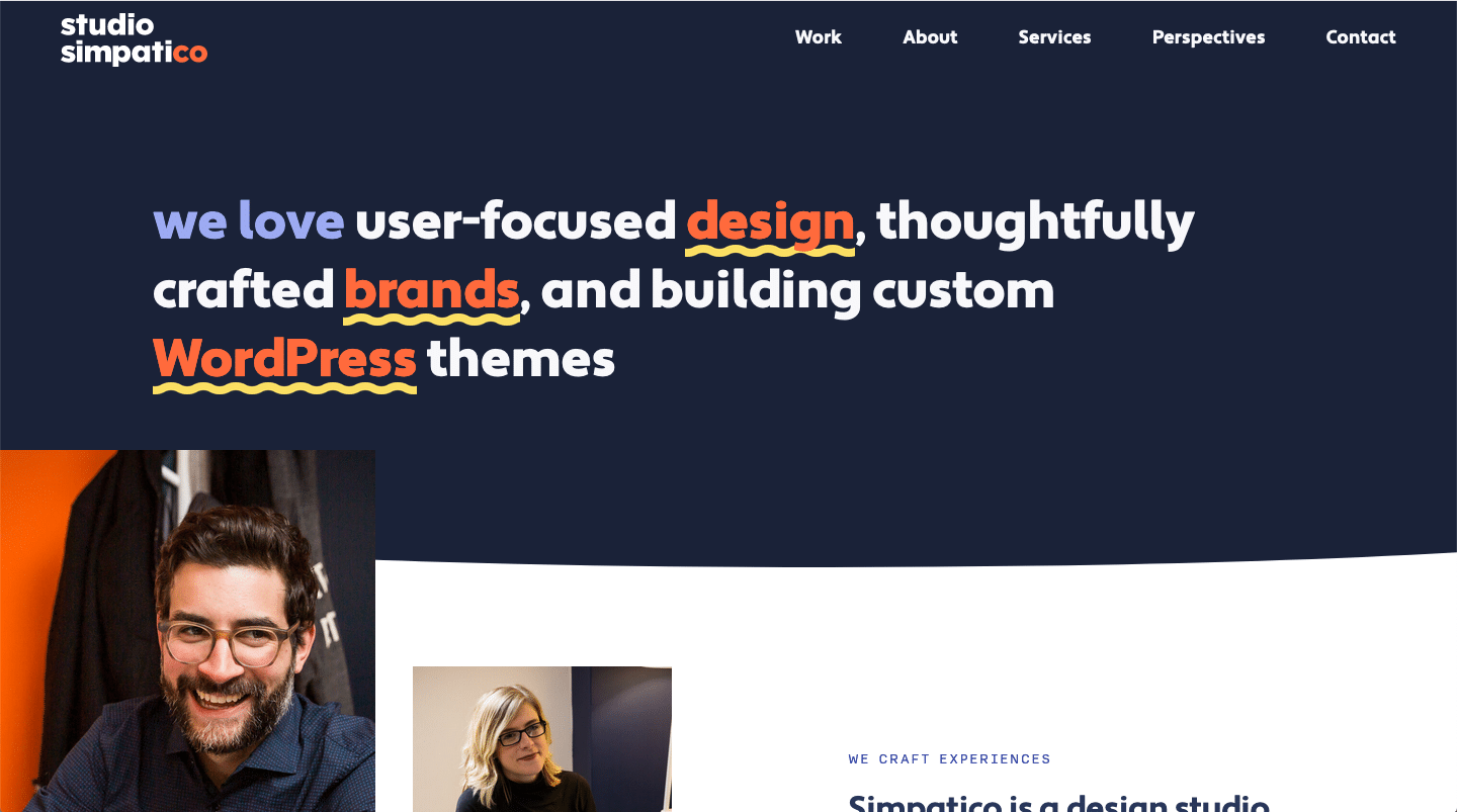
#1b2337 #ee724b #f5da7d #9Caaf2
As we now know, colors relay emotion. In this case, we can tell that a lot of thought went into developing this color scheme as all the colors go together so well, but really show the brand’s personality and pair very well with the professional photos used throughout the site. The burnt orange color against the mirage blue color is whimsical yet apparent.
45. Strong, Inspired, Joyful
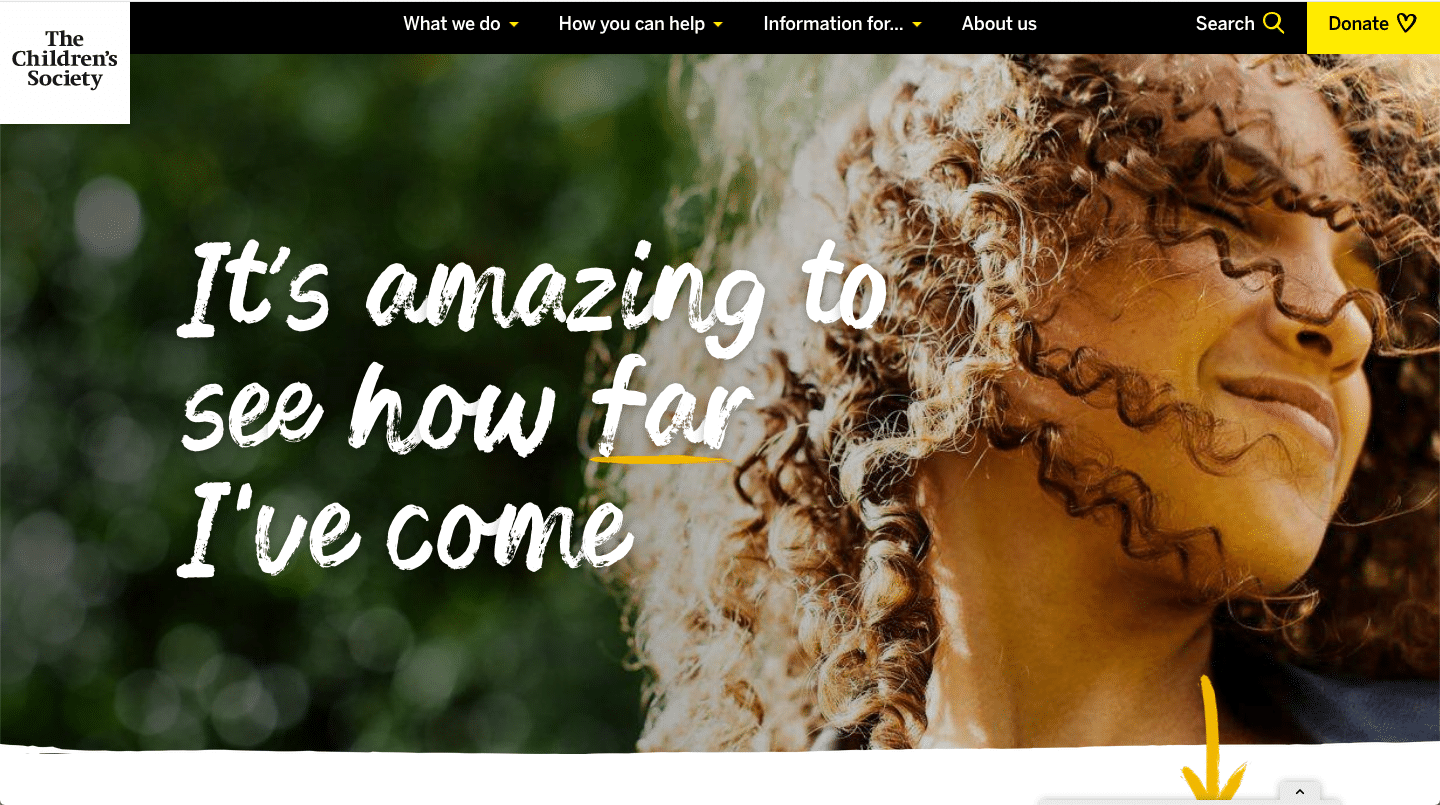
#000000 #ffeb32 #f1be31 #ef8533 #e5e5e5
The bright and bold colors used in this website no doubt exude the inspiration, hope, and happiness the Children’s Society is aiming to achieve. They pair strong and daring colors like golden fizz, saffron, and jaffa orange with deep contrast like black and mercury grey to boldly get their mission statement across — which they do effortlessly.
46. Earthy, Organic, Trustworthy
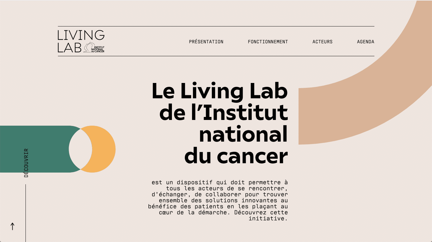
#d9b395 #eee5df #f4b25c #3a7e6c #000000
The Living Lab of the National Cancer Institute uses organic colors of pearl and tan with natural earth tones like sandy yellow and viridian green to generate an ecosystem that emanates health, nature, and all things organic. This is a company that pairs scientists, patients, and shareholders for the greater good of curing cancers. Their site colors help to build that sense of confidence, trust, and well-being they are hoping to convey.
47. Effervescent, Striking, and Elegant

#132d3b #ec7e9a #e24897 #e56731 #eee8e4 #ebc22f
If you’ve ever seen the show “The Marvelous Mrs. Maisel” you know right away that this website mirrors the personality of the show’s star, Mrs. Maisel — effervescent, striking, and elegant all rolled into one. The lively pinks like cerise and Carisma, along with the vibrant flame pea orange, pair flawlessly with the rich tones of big stone teal and bright sun yellow to truly make this website a marvelous choice for color inspiration.
48. Comforting, Fresh, Sophisticated
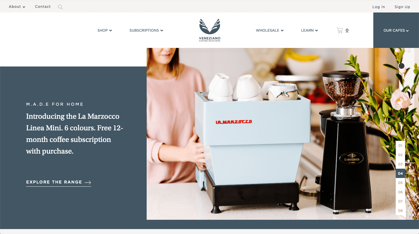
#425664 #f6f4f2 #c7af92
When you think of coffee, it’s rare to think of quickly sucking back a large to-go cup of steaming hot joe on the run. When coffee lovers imagine that first cup of coffee in the morning, the idea is to sit back and exhale all the worries the day will bring; to be in that moment and freely enjoy the luxury of the rich, hot coffee warming every inch of your soul. That’s precisely the vibes the Veneziano Coffee website gives off with their comforting, clean, and sophisticated color scheme. The deep and calming blue, the soft and subtle gray, and the hits of rich, golden taupe remind coffee lovers everywhere what coffee is really about and encourages them to sit back, take a moment, and enjoy the java.
49. Natural, Organic, Earthy
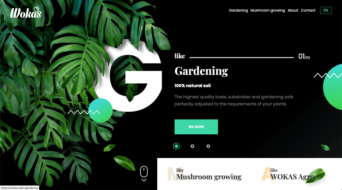
#000000 #3b3b3b #6ad7a6 #6ed563 #f6c187 #db512f
Wokas uses earth tones and soft, organic colors as part of its color scheme. This plant-based company has developed a well-branded website that displays boldness but also creates a sense of oneness with the land. grey and black, together with two shades of orange and two shades of green, offers a wide-ranging color scheme that heightens one’s senses and makes you want to buy the products they’re offering.
50. Sublime, Dreamy
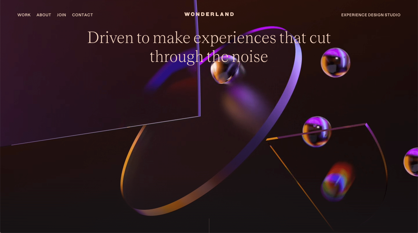
#ecd4c2 #ad35ee #2d130c #ce8f31 #151315
Wonderland is a User Experience agency that uses a pretty off-beat color scheme on their website, though it ended up working really well. As you’d expect from a user experience design agency, Wonderland’s website infuses dark browns and grays with contrasting colors such as Electric Violet and Brandy Punch Orange, which may not sound like they pair well together, but they do! The five main colors used on Wonderland’s website play perfectly into the professional yet playful vibes of the agency’s brand.
More website creation resources
And that, folks, is what we have for you today.
The full low down, the full monty, the whole shebang on website color schemes.
On a hot streak with learning about all this website design stuff?
We’ve got you fam!
Check out our related posts below to keep cranking on your website building journey!
[adinserter block=”2″]
