As always, here’s the Wix tutorial video:
Alright guys so in this post we’ve got a tutorial on how to use wix to make a website.
We’ll show you how to change fonts and colors, make sections and buttons, add videos, setup your header menu and footer, make a contact form so visitors can email you…
While we're definitely NOT going over absolutely every detail you'll find in the Wix documentation, here we have basically everything you need to know about how to make a wix website!
We’ve got a ton of ground to cover so in the words of everyone’s favorite news Youtuber, let’s just jump into it!
Note: in case it wasn't obvious, you'll need to get started with your *FREE* Wix account to follow along with this tutorial.
4.5/5


Ease-of-Use: 4/5

Customization: 5/5

Speed: 5/5

Support: 5/5

Price: 5/5
Contents
Sign Up to Create a Free Wix Account
Alright so the first step is to simply sign up for Wix.
If you use that link above we actually make a bit of commission (no extra cost to you) as a kind of thank you for the tutorial; no one pays us to make these posts and videos so commissions like that are what fuel our ramen addiction
But if you don’t like us and don’t want to use it just head to their site and we’ve still got your back with this tutorial because that’s the kind of people we are.
Either way, get over to Wix and click the start now button. It’ll ask you to sign up, fill out your details and then hit that big Sign Up Button (because signing up is what we’re doing here!).
Choose a Wix Template (Or NOT)
So now Wix will ask you a bunch of questions you don’t really need to answer since you’re following our how to use Wix tutorial here so you can just skip it and save some time.
From here you’ll be taken to a page that offers to create a site using “Wix ADI” – basically building a site automatically based on your responses to the questions we didn’t answer.
SO we want to choose the “Create Your Website with the Wix Editor” option by clicking that “choose a template” button.
Boom, here you’ll see a lot of cool templates, they’ve got tons of great options to choose from but for this Wix tutorial, we’re going to start from scratch so you can learn how to use Wix without a bunch of distractions from shiny awesome pre-built website stuff.
So scroll up the left side menu to find “blank templates” and click the one that says “start from scratch” then “edit.”
Skip the tutorial because we’re doing one here (ours is more in-depth if we may be so bold).
Now we’re inside the Wix web builder.
Using the Wix Website Maker
So really quick let’s go over the interface so you know what everything is.
At the top, you’ve got your current page (“Home”) and when you add more pages you’ll be able to switch to those here.
If you need to add a page, click on the menus and pages button then add a page.
Going back to the top menu, here you’ve got a few more options/tools:
- Desktop/Mobile views (more on this later, with over half of global internet traffic coming from mobile devices we definitely want to make sure your site looks good on phones).
- Save, Preview, and Publish Your Wix website.
- A bunch of other settings (we usually don’t touch these – to start at least).
- Tools for toggling rules, grid lines, stuff you use when Wix to create a website.
- Code – don’t worry about it
- Help – don’t worry about it, we’ve got you
- Upgrade – more on that later.
Creating Your Wix Website Design
Alright now to the meat and potatoes (kale and potatoes for our vegan friends out there).
Customizing your Wix website design!
For this Wix tutorial, we’re going to make a generic “lifestyle” brand because everyone loves “lifestyle.”
If you want to get real gosh darn deep with how to design a website check out our big ‘ol guide on it!
Sections of Your Wix Editor Pages
So you’ve got a few sections to play with here.
The header is at the top, that’s where your navigation menu will go (see below). The main “page” section is where you’ll put all the images, content, “main sections” of your site, then the footer is down at the bottom “where feet go.”
To start we’re going to add some awesome sauce to the main “page” section.
Adding Backgrounds
So we’re going to start by adding a background by clicking the add button, going down to “Strip,” then picking the style we want for our Wix website.
For this tutorial, we’re going to go with this one that has a little camera symbol, which means the background actually moves.
Click it to add then it’ll automatically appear in the page section.
Then we dragged it up into the header because we’re going to make a semi-transparent header that’s going to go over the top of the page section.
Changing Text
Now to change text just double click it.
From here you can:
- Write new words.
- Move the text around
- Change the font size
- Change the font color
- Change font (eg Times New Roman, Ariel, or something way cooler than those because this isn’t a high school English paper)
If you’ve ever used a word editor like Microsoft Word or Google Docs, it’s basically the same thing.
You can also add effects like drop shadows which is pretty cool too.
Changing Buttons
With our text all spiffy let’s spruce up this button, so as with the text just double click and we can make some sweet upgrades using the “button settings” like:
- Changing Text
- Adding links (to other sites, other pages on your site, emails, phone numbers, anchors on this page of your site – more on the last one later).
- Making button links open in new window
Once we’re done with that, we can use the little paintbrush to change up the design.
Here you can switch up things like:
- Kind of button (tons of options here)
- Button color
- Button hover color (what color the button changes to when you move your mouse over it)
- Transparency
- Borders
- Round your button borders
We kept ours pretty simple and clean but looking fly:
Adding Sections
Alright, off to a good start but we need some more sections, we’re going to do an About Us because “lifestyle” is all about people and their stories.
So back to the left sidebar, click add again, all sorts of options here but we’re going to stick to the strip because it’s got pretty awesome pre-built stuff for us to play with.
Again, just click the thing you want and it’ll automatically get added below your existing section (our “lifestyle brand” section).
You can also click and drag, which works great for things like shapes (we’ll do one of those later on).
Changing Background Colors
The strip we chose is cool but that green isn’t on-brand for us, so to change it we just click on it then click on “change column background” then select color
You can also add video or image backgrounds, either using free stuff Wix provides or by uploading your own images and videos.
Image Settings
Just like everything else in the Wix website creator, just select an image and you get some settings to do things like add effects and animations or add background colors to darken or lighten the image or just give it a nice hue.
Adding Images and Videos from Wix’ Free Gallery
Continuing to build our page, we added a services section but it came with this blue background that just wasn’t on point with our vision so again, double click and we can change it up.
This time we’re adding a video, so from the background settings we selected video then over to “free from Wix” to grab something awesome and free and no videography work required.
All sorts of awesomeness here, pick what you love.
We found a pretty cool guy running in a field vid but it kind of washed out our text, that’s where overlays come in.
Adding Image and Background Overlays
To add an overlay to make text stand out a bit better, go to settings when you’ve selected a video/image/background color.
You can do a pattern if you want but we want to keep things simple so we just left that as none then choose a gray color we liked and set the “opacity” (how transparent it is – 100% would be all color and no image/video) at 75.
Boom!
Adding Shapes
While we’re at it, let’s add a shape – back over to the add button on the left side, select shape and for us, this triangle is kind of cool.
But it needs to be a bit bigger and maybe upside down because we could all be more upside down, click on the image and you’ll get familiar little white dots to drag and change the size and a rotate button you can use to flip tha script (shape).
Moving Things Forward and Back in Layers
If for some reason this shape or another part of your site was behind, you can right click on it and go to the “arrange” option to move things forward and backward in “layers” on your site.
Adding/Modifying Social Links
For our meet the team section, we picked one with a social bar, which we can actually change to whatever we want (it started out with just LinkedIn).
So we just click on that social button then click “set social links.”
You can then click “add icons” to select free ones from Wix.
Once you pick the right icon for the social media site you’re linking to, with the right look for your site, you can just add a link to your profile (we went with Insta).
Adding Contact Forms
Our pages is just about ready, need a way for people to contact us though.
We went with a strip that had a form in it, but you can add forms by themselves to any part of your page.
In our case, background, text and social icons all needed changing – done just the way we did it all for sections above!
For the form itself, important to click on it then click “set your email” so that any form submissions get emailed to you.
Side note: if you want a professional email (so instead of [yourname]@gmail.com something like contact@[yourwebsitename].com) we made a separate post on how to get a professional email address for free you can check out!
From here you can set all sorts of options for what form fields (name, email, message, etc) you want to have, and you can click the little * to make that field required.
You can also change what the “submit” button says and what messages appear when they successfully submit or miss a required field.
And as with everything else, use the little paintbrush to change up the design of any/all the contact form elements (field text font/size/etc, field color, any and all of it – that’s the power of the Wix website creator!).
Making a Header, Footer, and Menus with the Wix Website Creator
Awesome, now we’ve got the main page of our Wix website created, time to crank out the header, footer, and menus.
Making a Header
So if you click the top/header area it’ll highlight as orange then just click on change header design to make changes.
Here you’ve got all the same options as you did with the sections of the main page, adjust and tweak until you love it as usual.
For ours we also wanted the header to move with us as we scroll down the page, so with our header clicked we then hit the little gear “settings” icon then hit “freezes” to keep the header pinned to the top no matter how far we journey down the page.
From here we want to add things like contact and about us so people can click to go to those parts of our page.
If we had separate pages for each of those sections we could just add a link to those pages, but since we’ve got a one-page design here we need to use anchors to make the page scroll down to the right section when people click on our header menu.
Adding Page Anchors
So to add anchors, once again we head over to everyone’s favorite add button then all the way down to “more” then “Anchors.”
Instead of clicking we’re going to scroll down our website to where we want to add these bad boys then drag and drop them right to where we want them, where the bottom of one section meets the top of another.
Then double click the little anchor tag on your page to give it a relevant name, in our case “About Us.”
After setting up all the anchors for our sections, we need to add those links to our site menu so we can drop links to them in our header.
So we’re going to go to Menus & Pages in the left menu and instead of adding a new page, we’re going to click add a link, select “anchor” and select the right anchor we want this button to go to (About Us in our case).
Hit Done then we can name this “About” (or whatever your section name is).
Rinse and repeat for all our sections then we’re ready to add our header menu.
Creating Menus
So once we’ve got our anchors in place, we’re ready to add our menu to our header.
So head over to our perennial favorite Add button, scroll on down to “menu” and there are a ton of presets we can select from.
For this Wix tutorial, we just went with the standard one at the top, drag and drop over to the header then position to your heart’s content (we did the classic menu-right setup, dragging it over until it snapped and we got that purple line letting us know it’s aligned in the vertical center)
Create and Add Your Logo
[Blog post note]: In the Wix video tutorial we walk through how you can make your own logo for free in 5 minutes, but we’ve already made a separate post for that so check it out here to learn more!
Changing Up Dat Footer
Alright final piece of our basic setup is the footer.
And basically, it’s the same process as the header, just working with the bottom section instead of the one at the very top.
You can do all sorts of things in the footer but some common things to include are:
- Terms of Service
- Privacy Policy
- Social Icons and/or other contact info
- Copyright notice
Using the Wix Builder to Make Your Website Mobile Responsive
Sweet. Once you’ve set up your basic desktop page, definitely want to make sure that bad boy looks just as slick on mobile devices (it’s where about half of website traffic comes from these days and that’s only growing).
Not sure how to make wix site responsive?
We've got you fam it's super simple!
To make sure your website looks great on phones too, just switch to the mobile view by clicking the button up top to see how it’ll look.
Our tutorial Wix website was not so great…
So we went through and fixed it up to get it looking super spiffy.
All the same rules/tools apply here, and any changes you make in the mobile view will only be applied to visitors who come to your site on a phone (everything will stay just as jazzy as it was for your desktop view).
Some things you should check for/fix in mobile:
- Font size
- Font alignment and alignment
- Button size
- Anchor placement
- Adding/Deleting Space between page elements
- Hiding elements to keep things clutter free
- Mobile Header Menu Size
Upgrade to Wix Premium and Get a Domain Name
That’s basically it!
You’ve got a website, if you’re good with the free version just hit publish and you’re live.
BUT…
We highly recommend upgrading and getting a custom domain name.
With a Wix premium plan you’ve got a lot more options, including things like:
- Higher/Unlimited Bandwidth to handle all the traffic that comes to your site.
- High storage to let you have more photos and videos on your site.
- Removing those clunky Wix ads.
- $$$ in ad vouchers.
- Some sweet add on apps that normally cost a decent chunk of change.
And if you choose a 12-month plan you’ll get a free domain name and a discount which is awesome, so if you’re ready to do this website thing definitely go for the 12-month option!
Quick note: if you do grab a Wix premium plan and domain name, we highly recommend getting privacy protection for your domain name.
I made the mistake once of not getting this and got bombarded with five or six spam calls a day – you won’t miss the $10/year.
If you go for the premium plan and domain name, here’s how to set up your domain for your site (so instead of [yourusername].wixsite.com/[yourwebsitename], you can just have [yourwebsitename].com which is way more pro).
Connecting Your Domain Name to Wix
So once you’ve gotten your domain name and upgraded to a premium plan, head back to the Wix website builder, go up to settings and just click “connect domain.”
It’ll ask you if you want to buy a new one but since you’ve got that covered, just click “connect a domain” – just enter your domain and Wix will set up the rest!
Learn the main Wix dashboard
So far we’ve just covered how to create a wix website from inside the wix editor.
At this point you *should* have some good answers for your “how do I edit my Wix site” questions (if we’ve done our job well)!
BUT, no using Wix website tutorial would complete without at least a little bit of a look at the main Wix dashboard, where you can access parts of the wix toolset for managing your domain, some parts of your website(s), your account and billing details, etc.
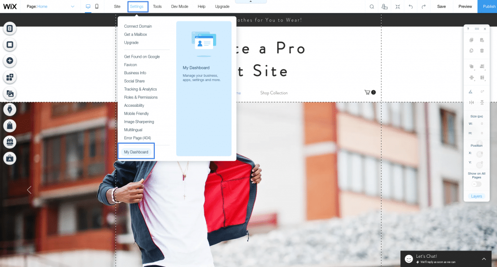
To get to the main Wix dashboard from the editor, click settings then go to the bottom and click “My Dashboard”
A few things you’ll find here:
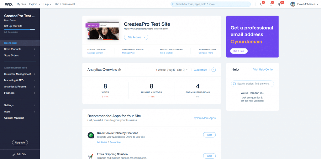
The main sidebar
This is where you can:
- Manage your products and orders if you have a Wix ecommerce store.
- Access your Wix business toolset including customer contacts management, marketing and SEO tools to help your site grow, analytics tools to see how your site is performing, and financial tools like invoices, payments, and quotes if you’ve built yourself a Wix lead generation site.
- Adjust your account settings like contact info, domains, email, etc
- Add or manage Wix apps
- Manage dynamic content like contact forms
The main control panel
Here you can:
- Connect your custom domain, upgrade your Wix plan, add email and more business tools.
- See a high level overview of your site’s analytics.
- Access the help center.
- Get some other recommendations (apps to add, the “getting started” walkthrough, see Wix’s latest blog posts)
Create other pages
In our main how to make a website on Wix tutorial video and written guide above, we *just* showed you how to make a one-page Wix site to help you learn the Wix editor and build something cool – fast.
But maybe you want to toss a few other pages onto your baby.
You totally can!
Some pretty standard pages that many websites (ours excluded because we’re rebels like that) are About and Contact pages.
Adding an About/Contact/Whatever page to Wix
To add any page (about pages included) to Wix, you’ll start by clicking the “Menus and Pages” button at the top of the Wix toolset sidebar, then “Add Page.”
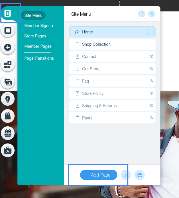
Now we’re right back to where we started at the beginning of our Wix tutorial, a blank page.
BUT NOW YOU’VE GOT THE SKILLS TO PAY THE BILLS.
So add whatever strips/sections/Wix free images and videos/contact forms you want to create some website design deliciousness in just a couple of minutes!
Sprucing up your site navigation
Wix automatically adds any new page you create to your header menu.
And that might work just fine for you.
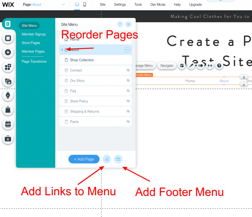
Want to change the order of pages?
When you create a new page you can just drag it up and down the pages list to move it around.
If you exited that menu to do some fine website creation work, just click on your header menu and the “Manage Menu” button to get on back there!
You can also add links to other websites using the little “link+” button at the bottom, or add a whole footer menu with the little “folder+” button.
Create a blog
Blogging is a solid way to build a brand and business online (we would know :).
It’s a way to create content to get people to your site through SEO or social media AND keep them coming back.
Starting a blog on Wix is v easy, the toolset is built right into the sidebar buttons!
Just click the little pen tip button the “add now” to get going.
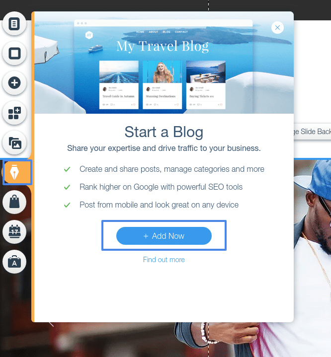
Wix then automagically gets a blog up and running for you in seconds, now all you need to do is click the “Create a Post” button to… create your first post!
Or you can stay on your main blog page and edit it’s design just like any other Wix website page.
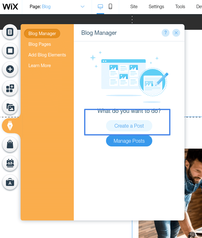
Creating a new Wix blog post
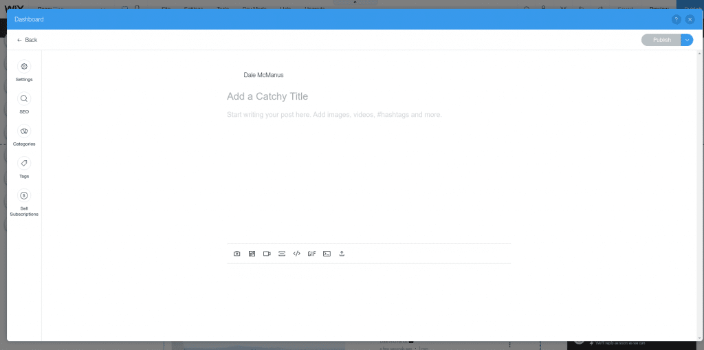
Clicking that “Create a Post” button will open up the Wix blog post editor, which works like a fancy Google Docs (or Microsoft Word if you’re stuck in the dark ages), letting you do things like:
- Write your blog post (duh)
- Add Wix free images (or other images you upload)
- Tweak your blog posts’ SEO
- Add tags and categories to help your readers find more posts they’ll love
- Create subscription plans for your blog (if you’re getting fancy with some premium content
Create an ecommerce store
Of course, Wix ecommerce is definitely a thing and of course, they make setting it all up pretty darn quick and pretty darn easy.
Some of the tasty treats (features) you’ll find here:
- Add any/all of the products you want
- Sell physical or digital goods
- Track orders and customers
- Accept online payments
- Set custom shipping rates
- Customize your storefront/cart design
- Sell on Facebook and Instagram
- Track and manage sales with the mobile Wix App
Adding an online store to a Wix Website
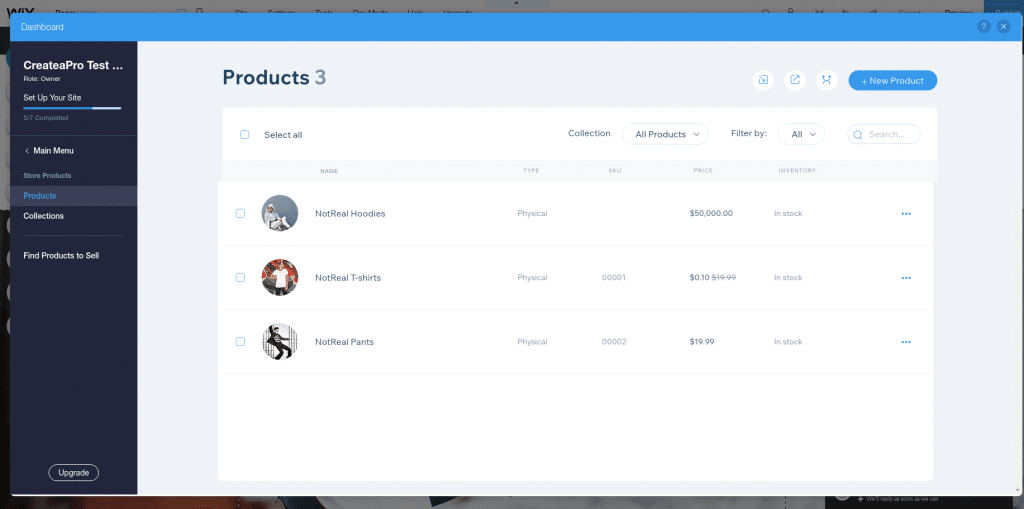
To get your Wix ecommerce journey started, click the apps button on in the Wix editor sidebar and search for “store”.
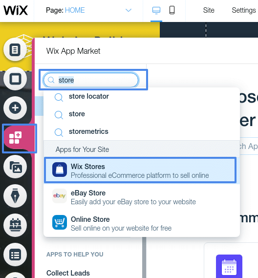
Click the “add to site” button after that, a couple seconds and Wix has your store ready for you to work your magic!
To manage your store and add products, there’s now a “My Store” button with a little handbag icon in the sidebar, which loads a separate interface to let you get everything all nice and set up.
Add Wix apps
Wix comes with a whole lot for you out of the box.
But sometimes a whole lot is not enough.
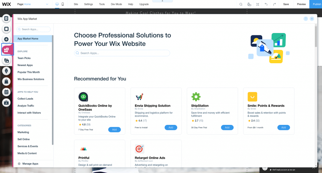
That’s where the Wix App Market comes in!
With over 230 apps there’s a ton here to help you drive traffic, add dropshipping capabilities, get customer reviews, and display media.
Add apps with just a couple of clicks, starting with the aptly named “Add Apps” button in the sidebar.
Click that and you’ll be able to search for anything you need.
Smash the “Add button” on one you like, test out that bad boy and keep on building!
How to use the Wix ADI builder
Waay back in the good old days (the top of this tutorial) we mentioned starting with a Wix Template rather than the Wix ADI (“Artificial Design Intelligence”).
Getting your hands dirty with the proverbial “nitty gritty” of website building with Wix is what we imagine you’ll want to do, seeing as your interested in learning how to create professional websites and all.
But we’ve all of us only got 24 hours in a day, and time saved is time saved.
And Wix ADI can save you a bunch of it by asking you a few questions and setting you up with a semi-custom site.
In general it’s for less tech-savvy users – think Maybel from “Maybel’s Fine Diner” – she wants a site, doesn’t want to pay someone a lot of dough for it, but doesn’t really want to do more than throw up a couple of pages and not think about it ever again.
But curiosity is a great thing to have as you dive deeper into some good ol’ fashioned website building, so here’s the general process for building with WIX ADI.
Wixi ADI builder step 1: Get started
Back up at the choose a Wix template phase of our Wix tutorial (after you've created your 100% free Wix account), choose the Wix ADI option instead of Wix Editor.
Wixi ADI builder step 2: Answer some questions
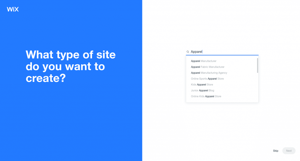
You’re then going to be asked a few questions to help Wix automatically build your initial site pages and layouts.
- What type of site do you want to create?
- What do you need on your new website?
- What is the name of your website?
- Do you want to import your images and text?
- Review and edit your info (add your contact info)
Wixi ADI builder step 3: Set up your Wix website design
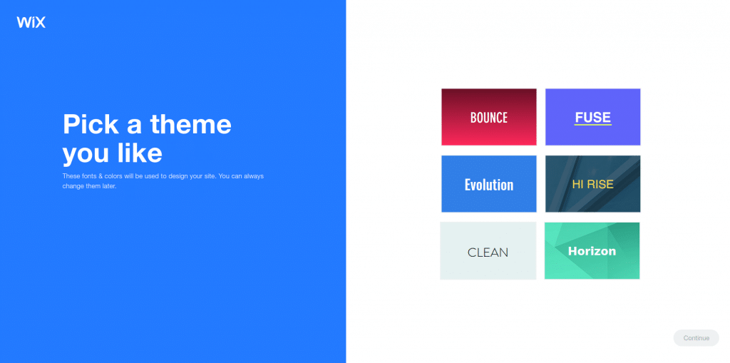
ADI’s gonna do a lot of the design work for you, but you’ve got some customization options available, starting with choosing an overall theme:
Then your homepage design:
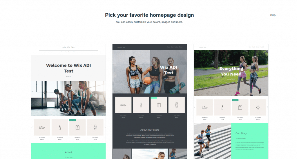
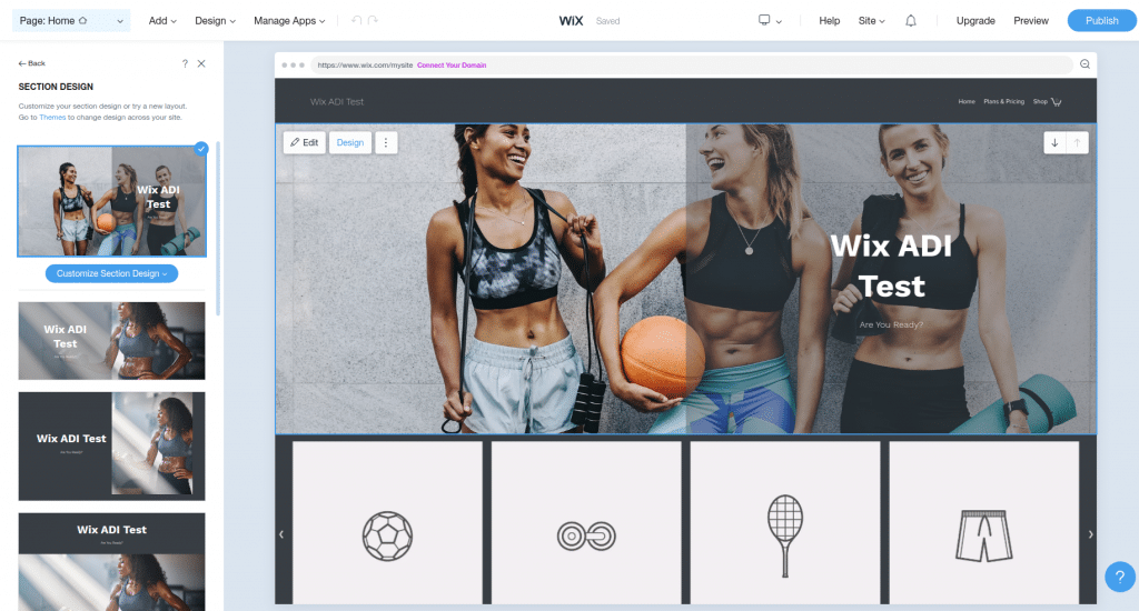
You’ll then be gently laid to rest in a simplified version of the Wix editor that will let you do customization things like:
- Add pages/sections to pages
- Change colors and fonts
- Add images/text/videos
- Add apps
Wixi ADI builder step 3: Make it SEO and mobile friendly
Wix SEO and creating your answer to the “how to make wix site responsive” question is easy with ADI.
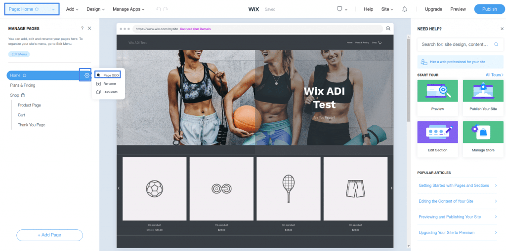
For the SEO piece, just click the “Pages” dropdown in the header menu, click the gear icon next to any page, then click “Page SEO” to add all the bits and bobs needed to help your site rank in Google.
Making your beauty mobile responsive is easy…
Because Wix ADI already did it for you!
Just click the little desktop monitor icon in the header menu, click the phone icon, and you can see what your site automatically looks like on mobile.

Wixi ADI builder step 5: Choose your domain name and publish!
Once you’re done editing it all to make your Wix website a dream come true, the only thing left is to grab yourself a custom domain and let ‘er loose on the world.
It starts with hitting the “Publish” button at the top right corner of the page.Select “Connect your Custom Domain”, upgrade your plan if needed, find a domain you like, and you’re launched!
How to Use Wix Tutorial: Complete!
So that is how to create a Wix website that looks awesome and can be a great start for your business.
If you found this Wix tutorial helpful be sure to check out our other written guides like the one on Best Website Builders, filled with all sorts of helpful website tips and tricks to help you launch your website!




This is an awesome post. I am impressed with your work and skill. Thank you so much.
Thank you so much! I’m really glad you enjoyed it!
How do you handle search engine optimization? I’ve been doing research and find that because of the use of Flash technology, Wix pages don’t rank well through Google Search.
SEO is a big giant subject in and of itself… we’re working on creating some guides around it but in the meantime Brian Dean/Backlinko have the best info in the industry!