For the record: It’s super important for us to keep this site 100% free for you and 100% high quality. To help us do that, we’ve partnered with some of the products we recommend and earn a commission if you buy through our links. Read our full disclosure and partners list here.
To get started, go ahead and click here to go to HostGator to get your discount through our affiliate link then use the tutorial below for easy, step-by-step directions!
What up y'all, welcome to our FREE guide on how to create a website!
Our mission here at Create a Pro Website (we like to call it CaPW for short) is to help you learn how to make your own website without having to know any coding skills OR pay some fancy web guy a cool $5k for something you can definitely do yourself!
Also, in case you’re more of a visual learner. Here’s my step-by-step video tutorial for How to Create a Website with WordPress (our favorite website creator):
Website builder vs WordPress: Which is best for website creation
Back in the day, if you wanted to create a website, you had to learn HTML, CSS, or some other form of coding to make it happen, which may have well been equivalent to learning an entirely new language.
It was time-consuming, difficult to view simple changes, and just straight up DAUNTING to get into.
Thankfully, times have changed and now if you want to design a website!
Let’s kick this thing off by going over the 3 ways you can start your new website.
Make your own website with a website builder
When people think to themselves “gee, I’d love to create my own website” a lot of them remember those Youtube Wix ads or Joe Rogan talking about how great Squarespace is.
Website builders are the “all-inclusive package” of the website building world
With one service, you get:
- A domain name
- Web hosting
- Drag and Drop tools to build a website without any coding knowledge
- Professional Email
- Technical Support
TL;DR – using website makers like Wix and Squarespace is recommended for a lot of beginners.

Wix
4.5/5


Ease-of-Use: 4/5

Customization: 5/5

Speed: 5/5

Support: 5/5

Price: 5/5
They make a lot of life easier.
BUT they’re not our favorite way to create a website for two reasons:
- They cost more (usually $8-16/month); while there are free versions, we don’t recommend those for professional websites.
- They’re not as customizable as our favorite way (you can do a lot with the best website builders, but all of them trade ease of use for complete control/customizability)
That being said, we have a step by step guide on how to build your own website with website builders below if this is the way you want to go!
Pros
- Easy to use
- Comes with customer support
- Updates and security are handled for you
Cons
- More expensive
- Not as customizable/flexible
- You can’t add extra features
You can learn more about the pros/cons in our complete guide to the best website builders here!
Make your own website with WordPress
WordPress is most definitely our favorite website creator!
It does a lot of the same things for you that website builders do (aka let you create a website without knowing how to code).
BUT WordPress is 100% FREE.
You just have to pay for hosting. We like HostGator for that as it's easy to get started for as little as $2.75/month!
AND WordPress gives you complete control over your website.
With plugins and themes, you can build just about any website without learning how to code at all.
If you learn a bit of coding, you can definitely do anything you want!
Plus, since basically every one of the best web hosting services has a one-click installer for WordPress, a way to buy domain names through them, and email, the only real downside is that it might take you a bit longer to learn how to build the exact website you want with WordPress.
But we’re here for you on that front people!
Below we’ve got a complete guide on how to make your own website with WordPress.
Pros
- FREE to use (you just have to pay for cheap web hosting)
- Complete control over your website design
- Easily add features with themes and plugins
Cons
- More of a learning curve than some website builders
- No technical support (you can pay people to help with this)
- You’re in charge of making sure your website stays up to date and secure
Make your own website with code
For the bold and the brave, every once in awhile website creators make sites from scratch with code.
For the most part, though, this is only for the big boys (meaning your Amazons, your Googles, your Nikes).
The reason is, EVEN IF you spend the hours and hours you need to learn all the HTML, CSS, Javascript, and PHP you need to make a website with code, it still takes HOURS AND HOURS to write all that code.
So even those people who are website coding masters like to at least start with something like WordPress to save a bunch of time.
That being said, if you’re looking for a new hobby and love to geek out, it can be pretty fun to learn.
Some good places for beginners to start learning include:
Pros
- Limitless website creation possibilities
- Ultimate control/flexibility
- Have fun learning something new
Cons
- Super steep learning curve
- Takes a long time to build a site (even when you know what you’re doing)
- No support (there are some forums, but sometimes no one will be able to figure out why your site’s not working)
How to create your own website with WordPress
Why we prefer WordPress for website creation
Wix, Squarespace, and other website builders are great, don’t get us wrong.
But, as “all in” professional website builders, we prefer WordPress and HostGator hosting when building our sites for two main reasons:
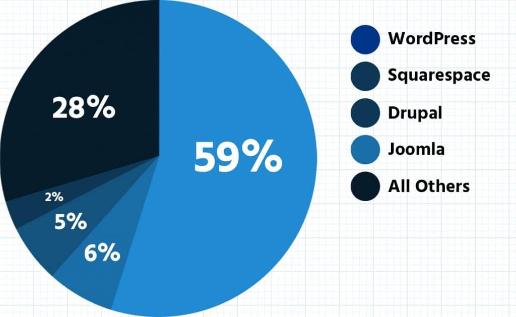
- The number of options: Because WordPress powers 30% of the internet, there are over 11,000 different templates and 50,000 different plugins, all of which means you can get just about anything done without having to code.
- Other website makers are limited: Not just because they don’t have as many templates/plugins as WordPress (though that is the case). But also because by their very nature, website builders like Wix and Squarespace can only let you do so much because they’re designed to be easy to use. That means fewer options so there’s less chance of things breaking for technical or “you screwed up” reasons.
With that quick little “you’re making the right choice” out of the way, if you want to go super deep we’ve got a big big how to use WordPress tutorial here.
For the quick and dirty version, keep :clap: on :clap: reading :clap:.
Step 1: Secure a domain name and fast web hosting
For some of you, after you see this title, you may be wondering… what the crap is a domain name? If that’s the case, make sure to watch this video:https://www.youtube.com/watch?v=Y4cRx19nhJk
Domain Name = Address to your website
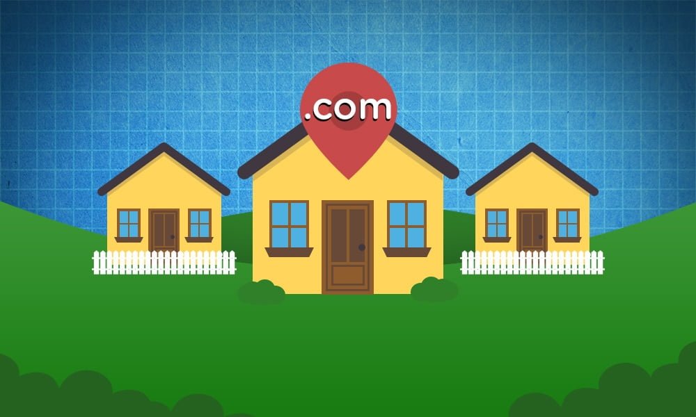
So think of the internet as a map full of avenues, streets, and turns everywhere. Think of your website as your house. In order for anyone to find their way to your house (even you), you need an address. This address is your domain name.
Every website has an IP address, or a string of seemingly random numbers to identify it. Like this:
71.287.131.106
So when you register and purchase a domain name, it’s like saving your home address into your phone’s maps, as “Home”. It takes this weird set of numbers and assigns them a very simple name that you can type in anytime you want to go there; like typing “Home” into your phone‘s GPS.
So, when you type createaprowebsite.com into your browser and hit enter…
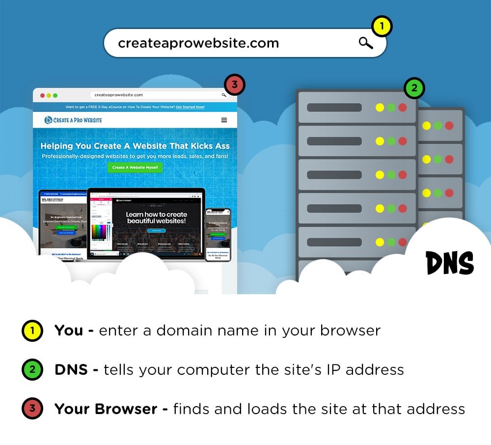
Your computer sends a request to a bunch of servers that make up the DNS, which is short for “Domain Name System“. This DNS then looks up the correct IP address and points your computer in the right direction. All within less than a millisecond…
So now you might be thinking, “Okay that’s great… but what the heck is a web host??” Again, I’ve got an awesome video for you with a very basic explanation as well:https://www.youtube.com/watch?v=H8oAvyqQwew
Web hosting is just a service that allows you to rent the space on the internet, fill it with all your media, and go public – like renting space out of a shopping center to open up your own store.
So, when you want to start a website, ALL of your text, pictures, buttons, and other media HAS to be stored on a server that is connected to the internet. No if, ands, or buts about it. And web hosting companies have buildings FILLED with these servers. They also provide you with design software, security, support.
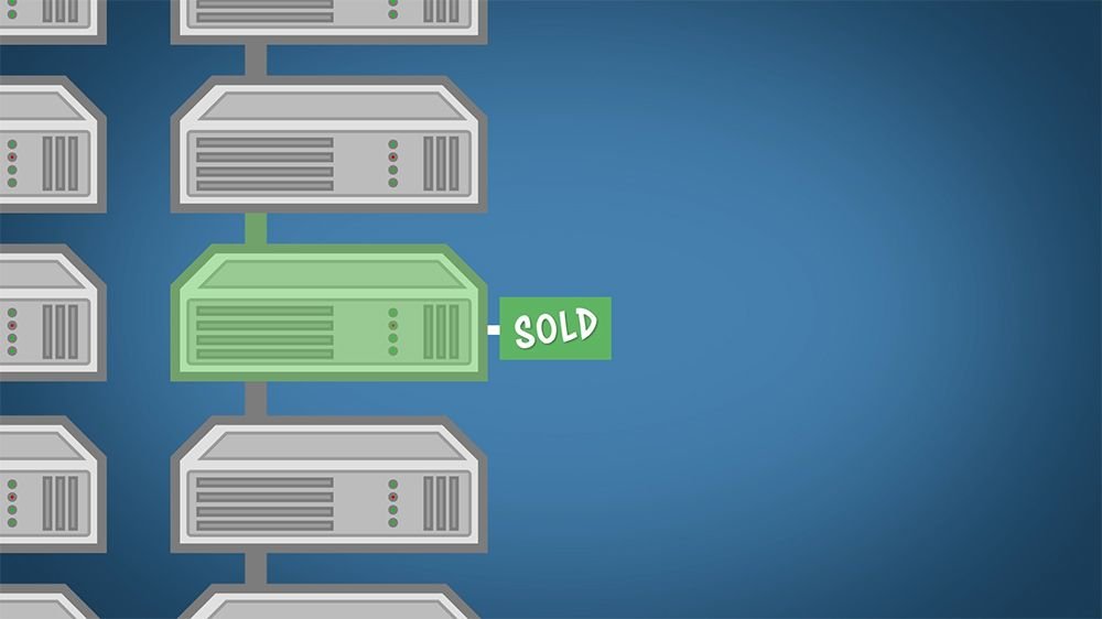
With that said, if you buy a domain name but don’t buy web hosting, then you would just type in your new domain name into the browser and end up on screen that says this webpage is parked, but not active.
Where can I get a domain name and hosting?
Great question!
We made a whole guide breaking down the best web hosting companies that you can find here.
But the short answer is, we almost always use HostGator because they’re affordable, quick, and easy.
Already have a domain name and hosting? Go ahead and skip to Step 3 where we show you how to install WordPress and set up your website.
Step 1) Go to HostGator.com
Because I use HostGator for my own websites, I’ve requested a SPECIAL DISCOUNT for Create A Pro Website visitors (First Month Hosting for ONLY $0.01).
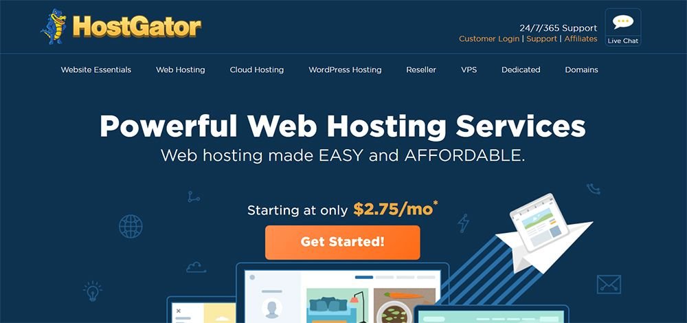
Step 2) Choose a Web Hosting Plan
Click on the “Get Started” button OR the “Web Hosting” tab and you’ll be taken to a page to choose your web hosting plan.
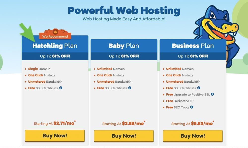
If you’re only planning to have one website, go ahead and choose the “Hatchling Plan.” It’s their cheapest plan available and all you’ll really need.
The “Baby” and “Business” plans are good if you plan on having multiple websites, but to start, just stick with the basics. No need to throw dolla dolla bills around if you don’t have to.
Step 3) Choose a Domain Name
How do you choose a good one?
Well, there’s not a secret formula, but keeping it simple is always a good rule with website building.
Shorter is usually better. If you’re reading this guide learning how to make a business website, stick to something easy like yourbusinessname.com. Or, if you want more of a lifestyle or portfolio website, try YourName.com.
If your name is taken, try a combination of words and add some descriptive words for fun!
- YourNamePhoto.com
- YourNameArt.com
- YourNameBlog.com
Or whatever your website is about. No need to overcomplicate it because the goal is to have something easy to remember for your visitors/clients/customers/etc.
Don’t use numbers – It’s kind of wonky when people try to go to your site by memory. Was it “4” or “four” or “for”???
OUR TWO CENTS: Use a .com whenever possible. Domains that end in .org and .net are okay but a .com adds a sense of legitimacy to your website that can’t be matched.
There is also .biz, .tech, .tv, and plenty more but I don’t recommend these unless you’re desperate.

*Important Step: After you choose a domain name, I HIGHLY recommend adding Domain Privacy Protection (below). I made the terrible mistake of not doing this when I bought my first domain and my phone EXPLODED with solicitor calls. Seriously, I received 10-15 calls a day until I went back and got it. If you don’t have privacy protection, then your phone number, email, and address will be publicly visible to solicitors.

Step 4) Create a Username & Set Your Billing Cycle
Next up, HostGator will let you confirm your plan(Hatchling), and set your billing cycle.
The longer you commit to, the cheaper your monthly payment will be. So 36 months = $2.75 per month, while a month-to-month cycle is $10.95 per month. So if you’re purchasing your domain name for one year, I usually tell people to go ahead and get the 12 month hosting plan to go with it.
But if this is your very first website and you just want to get your feet wet, go ahead and get a single-month payment. You can always upgrade your plan at ANY time with HostGator.
AND…. I negotiated a very special discount with the team over at HostGator to get you a HUGE discount at checkout! (Anywhere from 45%-60% OFF depending on the plan you choose)

Next, create a username and PIN that you won’t forget and write them both down somewhere!

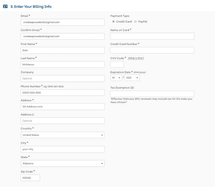
Step 5) Fill in Your Details
Fill in your personal information and credit card info (or use PayPal). Whichever is easiest for you.
Your receipt will be sent to the email address you enter in this section, so make sure it’s correct.
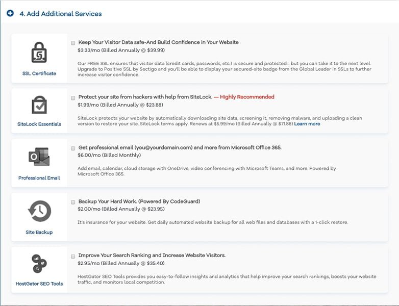
Step 6) Uncheck Additional Services
Before you checkout, HostGator will ask you if you’d like to add additional services.
When you’re starting out with your first website, I recommend unchecking the Sitelock Monitoring and Site Backup boxes. You won’t need them unless you’re able to bring in millions of visitors to your site. If you ever do, then you can always add them to your hosting plan later. (:
As far as the Professional Email box, this is there if you’d like a professional email like YourName@YourCompanyName.com instead of a plain old Gmail email (or whatever email service you prefer to use). But again, if you’re just starting out then this really isn’t necessary.
Step 7) Checkout
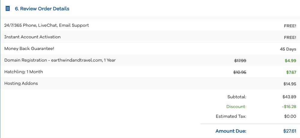
Like I said before, I negotiated a HUGE discount with HostGator for your web hosting package and domain name that's automatically applied when you use this link!
So just simply review your order details and checkout.
Step 2: Set up and install WordPress
Once you’ve secured your domain name and set up your hosting plan, you’re ready to get your website setup and running!
The first thing you’ll have to do is install WordPress.
WordPress is an online, open source website creation tool and it’s FREE! It’s one of the top programs in the world and I highly recommend it.
There are a few ways to install WordPress but the quickest and easiest is with the one-click install.
To Create a Website with WordPress, Use One-Click Installation:
1. Log into your HostGator account
2. Click on the Hosting tab at the top.
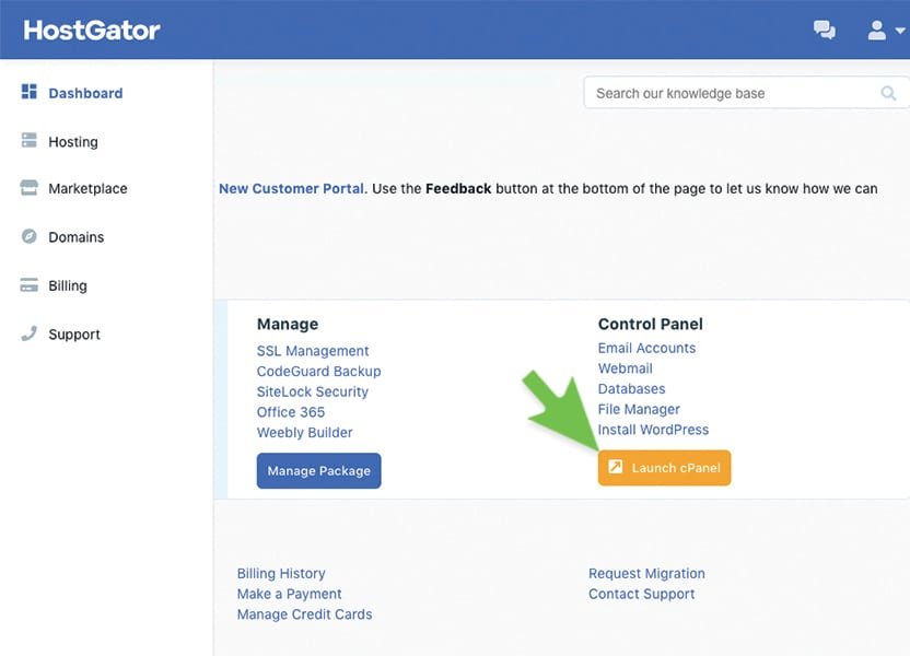
3. Click on the “WordPress One-Click” button under special offers.
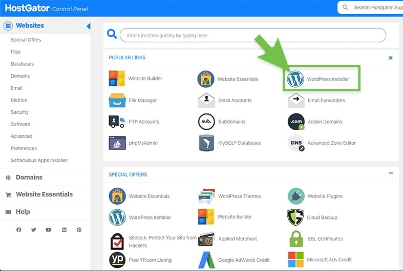
4. Select your domain for installation and hit “next”

5. Now just fill in your admin details, agree to the terms, and click “Install.”
- Blog Title = What you want to title your website (you can easily change this later)
- Admin User = Your First Name
- First Name = Your First Name (again)
- Last Name = Last Name
- Admin Email = Your Email

CONGRATULATIONS! You’ve just installed WordPress and you’re now ready to start customizing your new website!
Before you move on to the next step:
You’ll be taken to a screen that shows all your sign in info. You’re also given a RIDICULOUS password that you have no chance of remembering. Something that looks like this:
13JW56FX88K
I HIGHLY suggest writing that password down. And don’t worry, we’re about to reset it to something easier to remember…
Step 3: Customize your WordPress website
Now, it’s time to customize your website and bring out your inner artist! But we have to do a few things to get there:
- Login to WordPress
- Reset Your Password
- Choose a Theme and Customize
After this, we’ll cover how to add pages and set up your header menu. So, let’s get started! Log into WordPress,
1. Log Into WordPress
Type “(YourDomainName).com” into your web browser and ad “/wp-admin” to the end of it so that it looks something like this:
(YourDomainName).com/wp-admin
Example:

*I recommend bookmarking this page because it will be your own personal WordPress Login.
Hit enter and log in with your username and password that you saved earlier (you can just copy and paste the password).
2. Reset Your Password
Welcome to your WordPress dashboard! Let’s get rid of that default password and make our own.
Hover over the “Users” tab and click on “Your Profile”.
Scroll to the bottom and choose “Generate Password.”
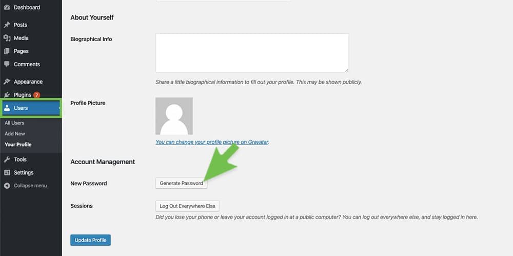
Erase the random generation it gives you, and type in your own new password. Then hit Update Profile to save it.

3. Choose a Theme For Your Website
With WordPress, you can customize every aspect of your website such as buttons, text animations, color schemes, background images, and MUCH more.
If you’re logged into WordPress, you can hover over “Appearance” and click on “Themes”. The just click the “Add New” button at the top. From here you can choose from over 1500 free themes!
Now you may be wondering, “Which one do I pick??? Where do I start??”
Well, here’s my Top 5 recommendations for free themes that offer the most functionality, customization, and user-friendly experience (None of these themes pay me. I just like them!):
- Astra
- Hestia
- Illdy
- Shapely
- Divi (premium but totally worth it!)
Again just click on Appearance > Themes > Add New.
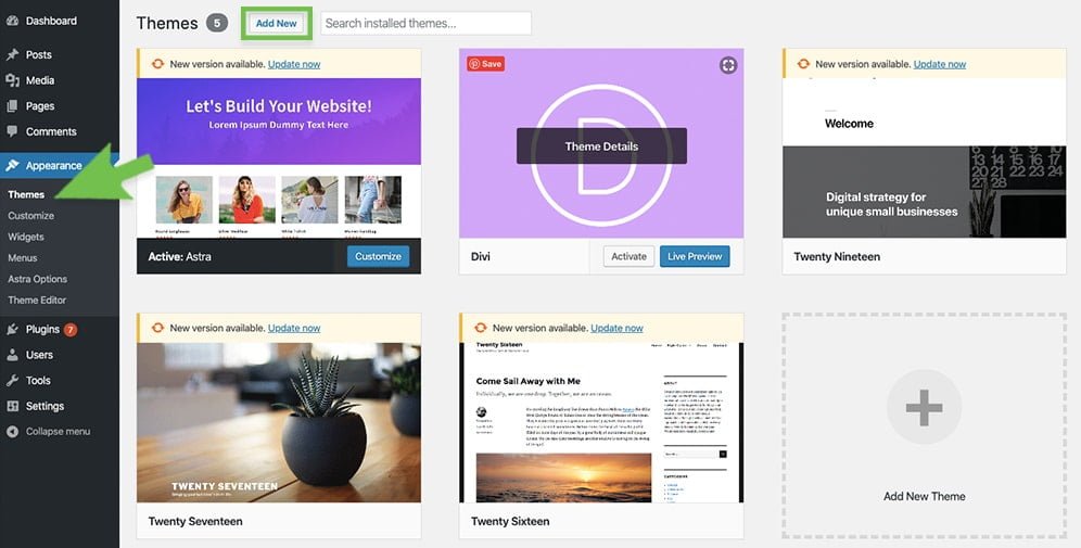
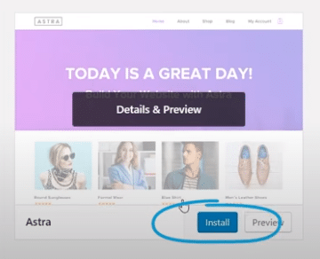
You can preview over 1500 free themes and select your favorite. But if this is your first website, then I HIGHLY recommend “Astra”. It’s free, incredibly user-friendly, and makes customizing your first website a breeze. Just click on the search box to search for a theme.
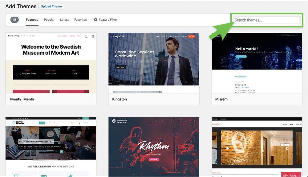
Then just click Install on your theme.
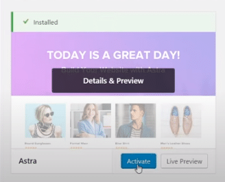
Then, just click Activate.
So once you’ve selected and installed a new theme, you can start changing the colors, fonts, and overall look of your website. Here’s how to get there…
Step 1. Hover over your website title at the top left of the dashboard and click Visit Site (or type in your domain to the browser).
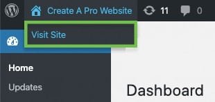
You’ll then be taken to your website which now has a lot of sample text and is overall pretty empty…
Step 2. To start changing colors, buttons, fonts, etc. just click on the “Customize” button at the top of the page.
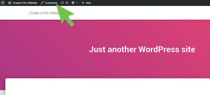
From here you have a wide variety of options to customize such as changing text & button colors, adding background images & videos, and MUCH more. Feel free to play around in this customize menu to see how each section affects the look of your website.
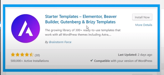
*If you chose Astra theme, I recommend installing the “Starter Templates – Elementor, Beaver Builder, Gutenberg & Brizy Templates” plugin to be able to customize with a drag and drop builder.
Step 4. Add a New Page to Your Website
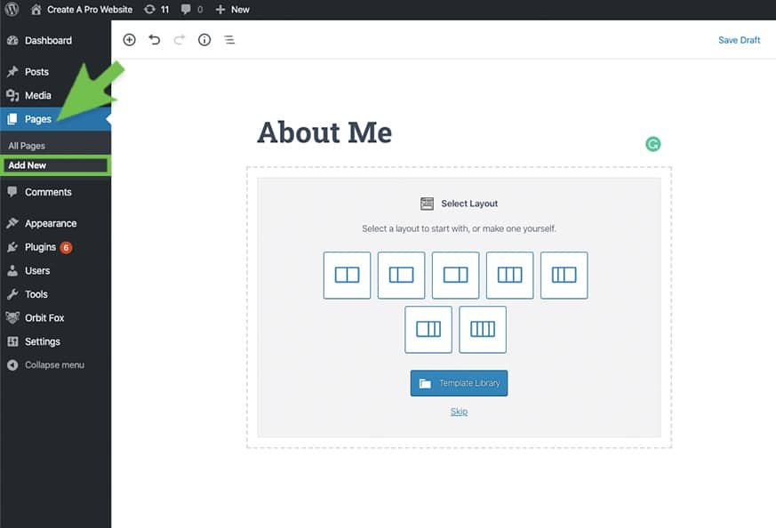
If you’d like to add an “About Me” page, “Services” page, or maybe a “Contact” page to your website (like I have at the top of this one), then you can do this by following the steps below:
- Go to your WordPress dashboard
- Hover over “Pages” and click on “Add New”
- Type in your title and body text
- Add new WordPress page
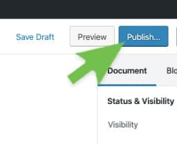
When you’re done, don’t forget to click the Publish button. (Or at least Save Draft if you’re not ready to publish).
5. Adding Pages to the Menu
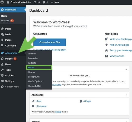
After you’ve created a few new pages, you may want them to be linked to a menu at the top of your website. Much like the menu at the top of this website or the top of your screen right now.
To do this, just hover over Appearance on the dashboard, and click on Menus.
Now, just give your menu a name and click Create Menu.

Look in the Pages box and check the page you’d like to add to the menu, then click Add to Menu.
Once added, just check the Primary box under menu settings, and click Save Menu.

Now if you visit your site, you’ll see a menu at the very top with buttons that will take you to the pages you’ve added.

6. Changing Your Website Title and Tagline
Title: This part is actually more important than most people realize. The title on the front page of your website is how search engines, like Google and Bing, decide how high your site ranks in search results.
So if someone types in “how to make money online”, ideally you would want your site to come up on the first page of search results so people will click on your website.
So this means your website title should be “How To Make Money Online” so it’s as similar to the keyword as possible.
This is why my website title is “How To Make a Website.”
Just hover over your mouse over the tab to this website to find the keywords (or see below).

Tagline: This is a secondary title that should explain what you’re offering in your website. Mine is “Step-by-Step Beginners Guide 2018”
To change the title and tagline on your website, go to your WordPress Dashboard > Settings > General.
Then you’ll see a couple of boxes at the very top to write in your title & tag.
Making a Website with WordPress: FAQs
Should I create my own website with Wix or WordPress?
Both are for sure solid choices (that’s why we’ve got tutorials for both here!).
Wix is going to cost you more and limit your options long term, but their drag and drop builder is probably easier for most people to figure out how to use.
If you wanna save dat money and keep all your options open, WordPress with cheap hosting from HostGator is the move!
Is WordPress really free?
Yup yup!
You’ve gotta pay for hosting and a domain (if it’s not included for free like it is when you sign up for hosting with Hostgator).
And there are some premium plugins and themes you might want/need to snag at some point.
Do I need web hosting to make a website with WordPress?
You do.
The WordPress website software itself is free, but you need a way for that software to run and be accessible to other people on the internet.
That’s where web hosting from a place like HostGator comes in – when you get hosting, you get a website server that does all that for you.
How long does it take to create a new website with WordPress?
To get hosting and install WordPress with a one-click installer (like the one you get with HostGator), getting signed up and started is literally a 5-minute process.
After that, customizing WordPress with themes like Divi and plugins like Elementor will take anywhere from a few minutes to hundreds of hours depending on how deep and wide you want to go with it.
Is it easy to maintain a WordPress website?
It is pretty easy, even as a beginner!
While website builders like Wix take care of all the updates in the background (which is admittedly even easier), keeping WordPress up to date just takes a couple of clicks of the “update” buttons. But, as with all things, it can get complicated.
If you find yourself using a dozen WordPress plugins with super-specific configurations, things might break when you update or sometimes “just because.”
That’s why we recommend you try to keep your website as simple as possible, just use and add the things you need. 🙂
What’s the difference between WordPress.org and WordPress.com?
If you’ve been looking into becoming a WordPress website maker you’ve probably come across this “WordPress.com vs WordPress.org” thing.
We have a more detailed explanation in our what is WordPress post, but the short story is that “WordPress.org” is the free software you install on your own hosting that we’ve been talking about here.
“WordPress.com” is the same software, but like Wix and other website builders, the WordPress.com team does all the server/hosting stuff for you.
How to create your own website with a website creator
Why you should use Wix for building websites
We’re totally transparent about our strong preference/undying love for WordPress here at CaPW.
But we’re also honest with ourselves in knowing that it’s just not the right move for some people.
WE STILL LOVE YOU FOLKS IT’S OKAY.
Why might you want to use a website builder instead of WordPress?
- So much is done for you: From taking care of hosting for you, giving you all the tools you’ll need for most websites, to dedicated customer support, website builders offer a complete package for making websites.
- They’re easier to learn: Website builders come with visual, drag and drop interfaces. Want a button after that header, drag it from the toolbox and put it there. What you see is what you get, and that’s easy for people to understand. WordPress can be pretty easy once you learn it, but there’s a bit more you’ve got to learn to take full advantage of what it has to offer.
Basically, if you’re looking to make only one or two great looking websites relatively quickly/easily, website builders are a good option.
If you just need one website for your restaurant, or maybe you’re going to help a friend or two out with websites for their businesses, you might not want to invest the time in learning how to work with WordPress.
You’ll have to pay more, but you’ll save yourself some time and trouble.
With that being said…
Which website builder should you use?

Wix
4.5/5


Ease-of-Use: 4/5

Customization: 5/5

Speed: 5/5

Support: 5/5

Price: 5/5
We’ve got your back here fam with a whole skyscraper level in-depth guide on the best website builders here.
If you want to dig in, have at it.
If you want to save time, we recommend Wix.
The price is right. The customizability is right. The support is right.
And we’ve got a whole “how to make a website with Wix” tutorial!
Quick and dirty version is as follows:
Step 1: Sign up to create your FREE Wix account
Alright, so the first step is just to sign up for your free plan Wix account.
Once you’re on the site click the “start now” button.
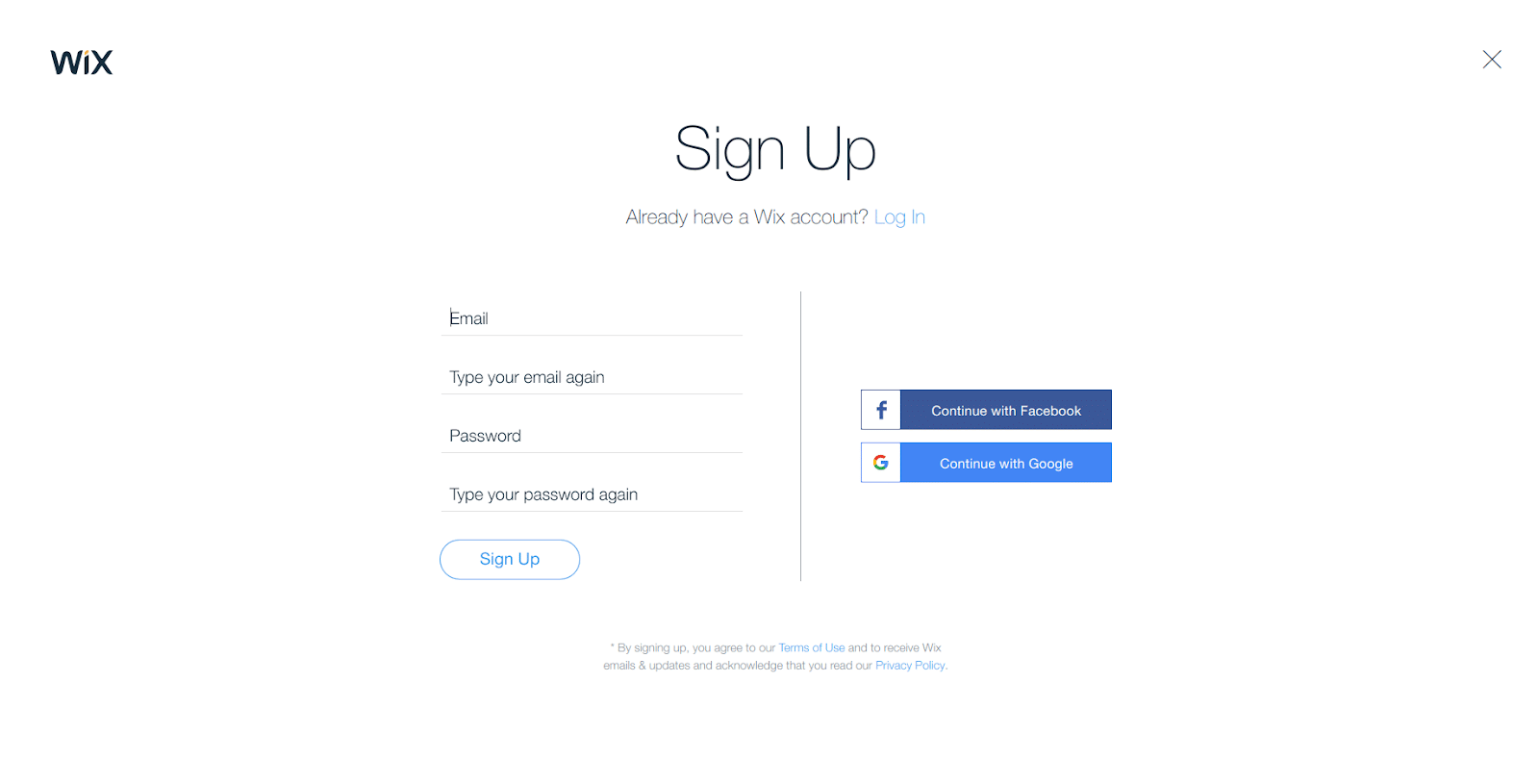
Then they’ll ask you to sign up, fill out your details, then smash that “Sign Up” button.
Step 2: Choose your Wix Template
Now Wix will ask you a bunch of questions you don’t need to answer since you’re following this here tutorial.
So just skip those until you get to this page:
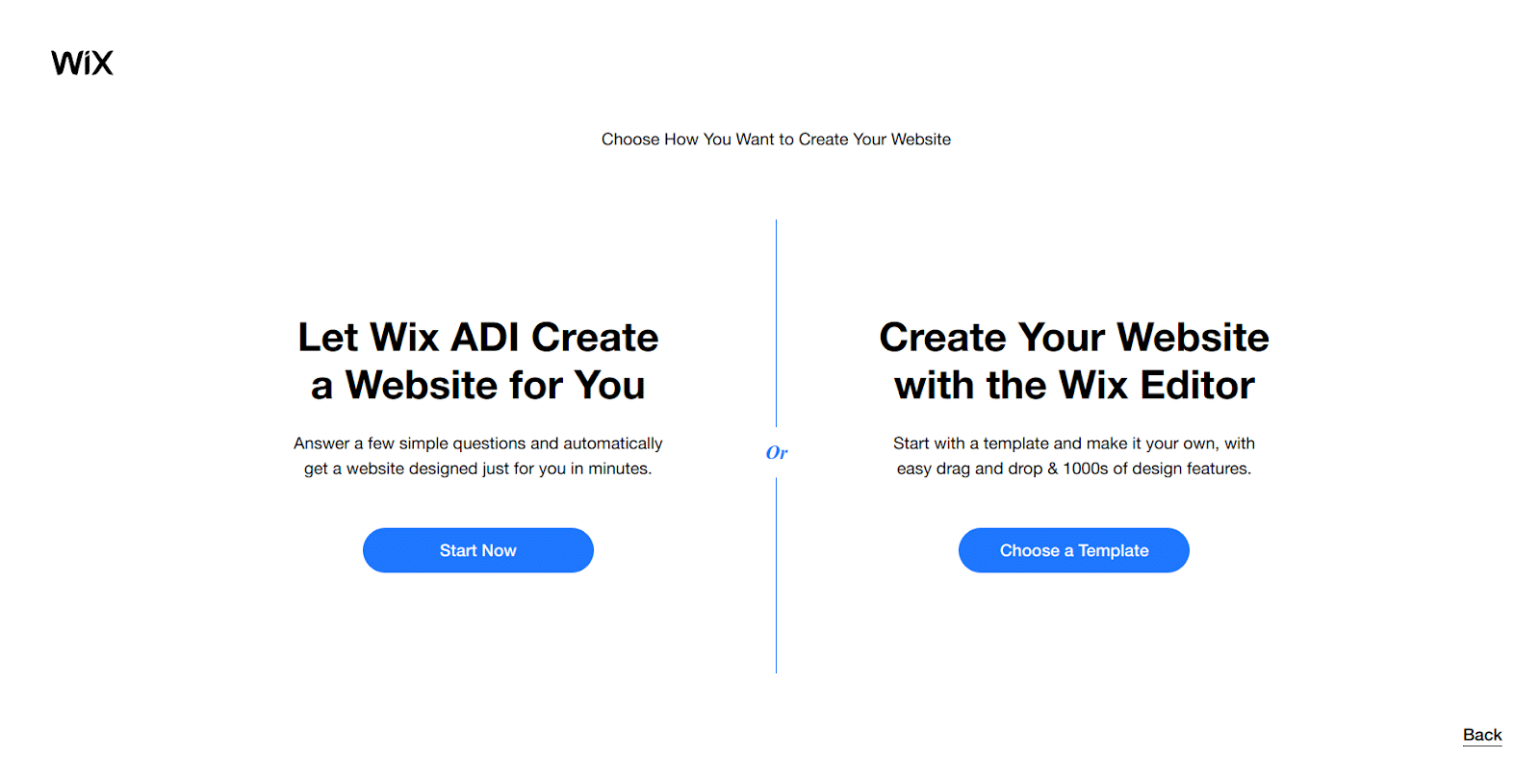
The “Wix ADI” is an AI-powered way to build a website automatically based on the answers to the questions we didn’t answer.
Because we’re going to get hands-on by choosing to “Create Your Website with the Wix Editor” and the “choose a template” button!
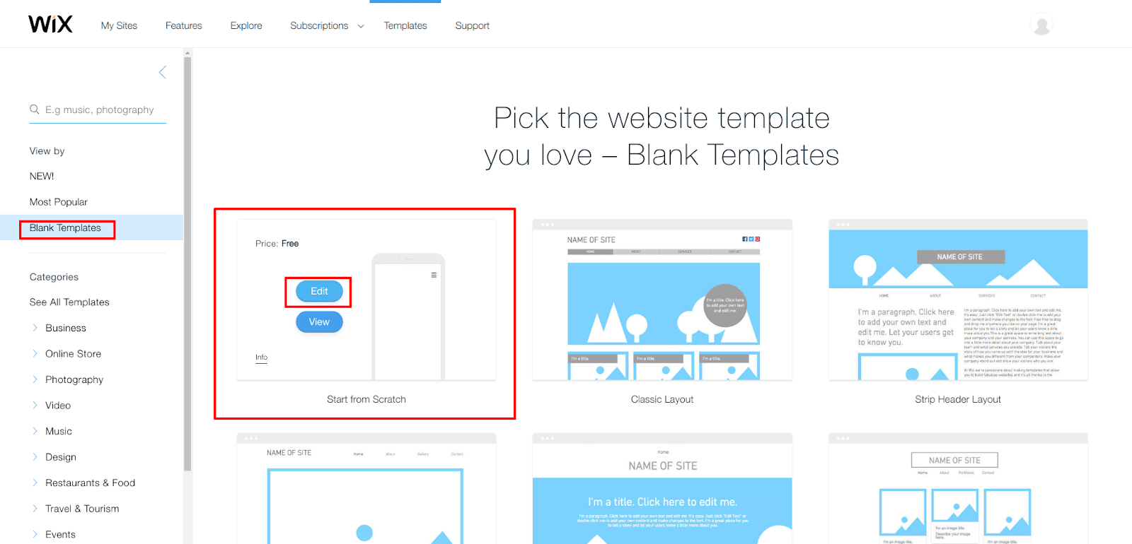
Here you’ll find a bunch of cool templates and great options to choose from.
For the sake of this tutorial, we’re going to show you how to start from scratch so you can learn how to use Wix.
Later, if you see a template you like, you can go back and restart with that and use your new website building knowledge to make it totally badass!
For now, scroll up the left side menu where you’ll find “blank templates” and click the one that says “start from scratch” then “edit.”
Skip the tutorial because we’re doing that here and now we’re inside the Wix web builder.
Step 3: Create your Wix website design
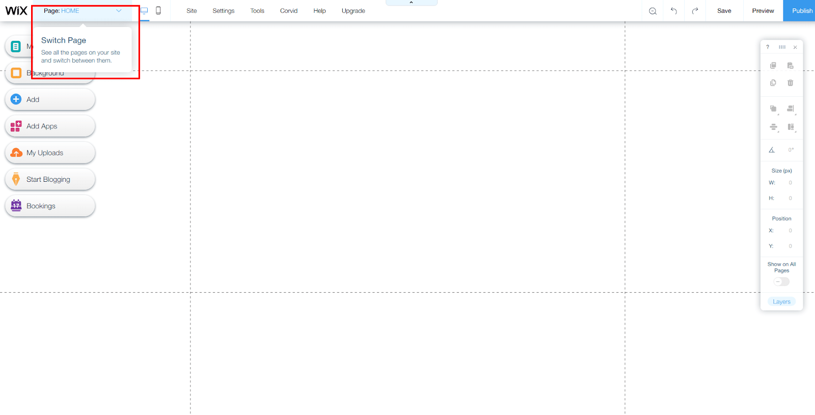
So really quick let’s go over the Wix editor interface.
At the top, you’ve got your current page (“Home”) and you’ll be able to switch to other pages you create here as well.
You’ll also find a few more options/tools:
- Desktop/Mobile views to see how your website looks on each kind of device.
- Save, Preview, and Publish your Wix website.
- A bunch of other settings (no need to touch these for now).
- Tools for toggling rules, grid lines, other stuff you’ll use when Wix to create a website.
- Code – don’t worry about it
- Help – for when your smarts/our tutorials aren’t enough
- Upgrade – more on this later.
Now to customization!
Again, we’ve got a whole in-depth guide on this stuff right in our full Wix tutorial.
But here are the basics:
Parts of Wix Editor pages
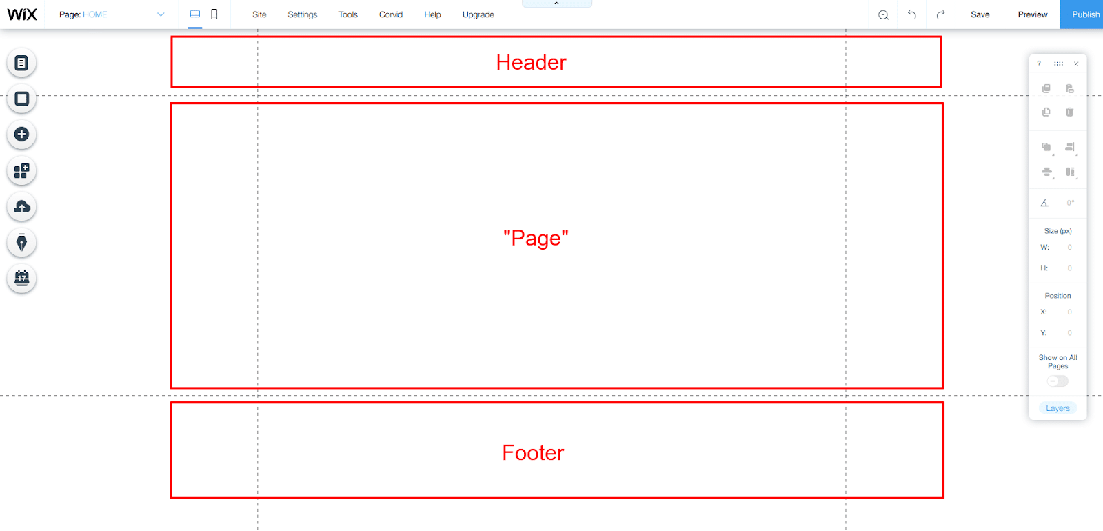
Alright, the main page editor has a few parts you can edit:
- The header is at the top, it’s where your navigation menu will go.
- The main “page” section is where all the images/videos/text of your page goes.
- Then the footer is at the bottom, this is where things like your copyright notice and privacy policy page link go.
Adding backgrounds
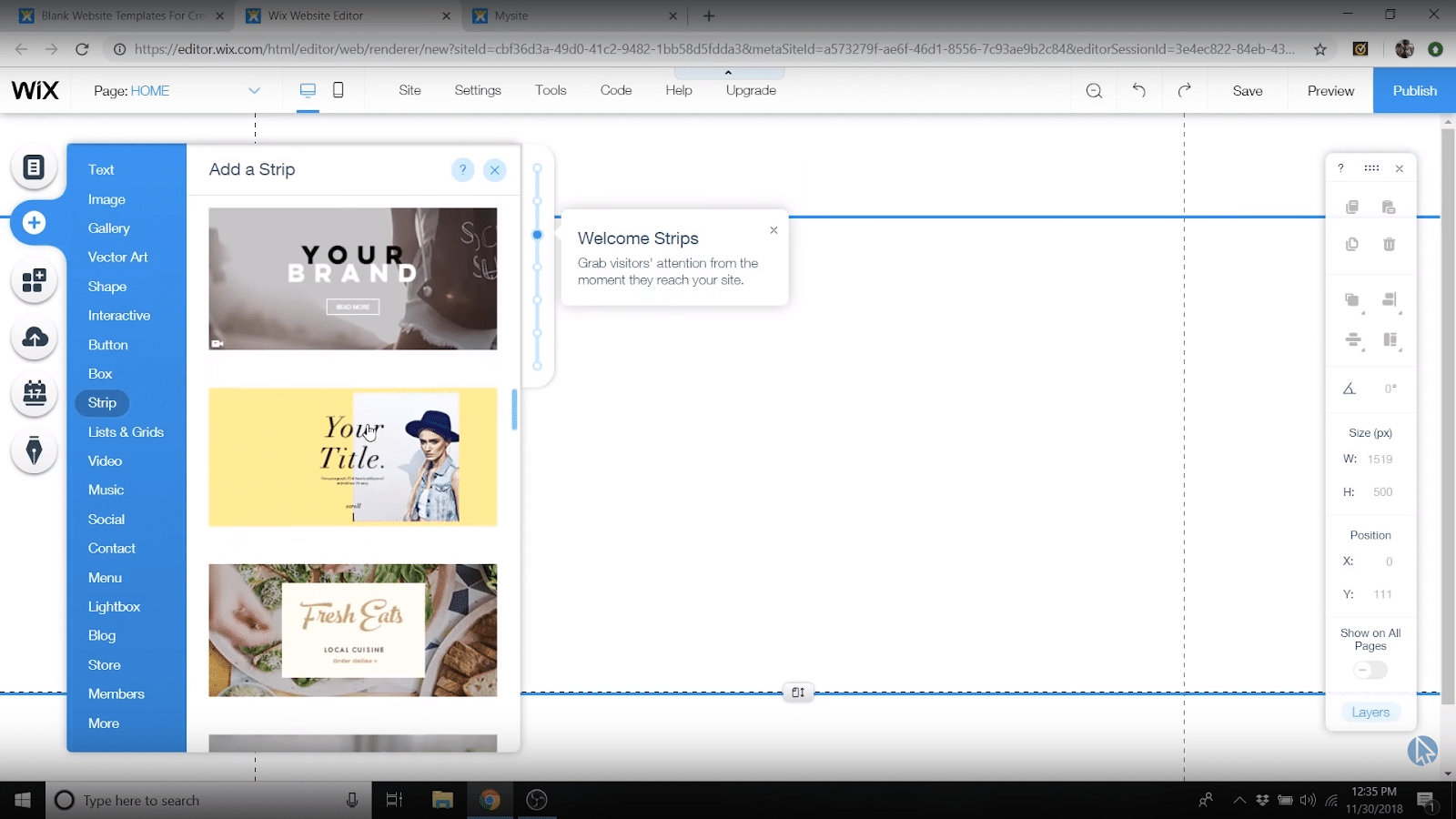
You can add backgrounds to your page by clicking the add button, going down to “Strip,” then picking something out that you like.
Changing text
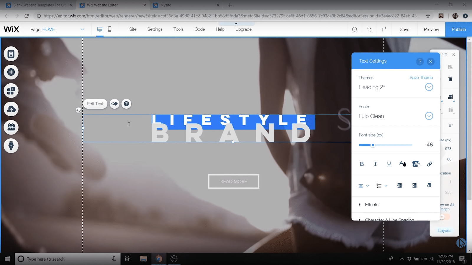
To change text, just double click it.
This lets you:
- Add new writing
- Move text around
- Change the font size
- Change the font color
- Change the font itself
Changing buttons
Double click on a button to bring up the “button settings” which let you:
- Change the button text
- Add links
- Make button links open in a new window.
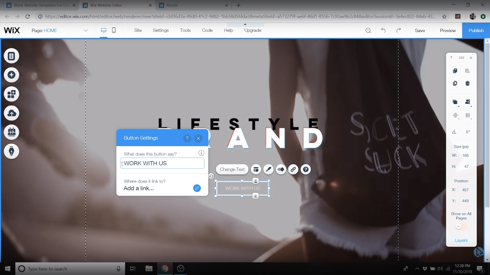
When you’re done there, you can use the little paintbrush button to change the design, things like:
- “Kind of button”
- Color/Hover color
- Transparency
- Borders
Adding sections
Now to add more sections to your page, head back to the left sidebar and click add again.
There are tons of things to add here but we recommend sticking with the “Strip” options because they take care of a lot of details for you.
So find a strip you want to customize, click it to add it below your existing section or drag it over to where you want it!

Adding images from Wix’s free gallery
If you click on any strip and you’ll have a “change background” option that lets you add a background color, or videos and images.
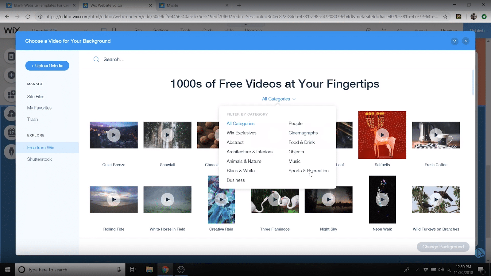
For those last two, you can upload/embed your own OR use Wix’s FREE images and video gallery!
Very handy indeed.
When you select “video” or “image” from the background settings, you’ll have a “free from Wix” option.
Find something you like, drop that bad boy in.
Adding social media links
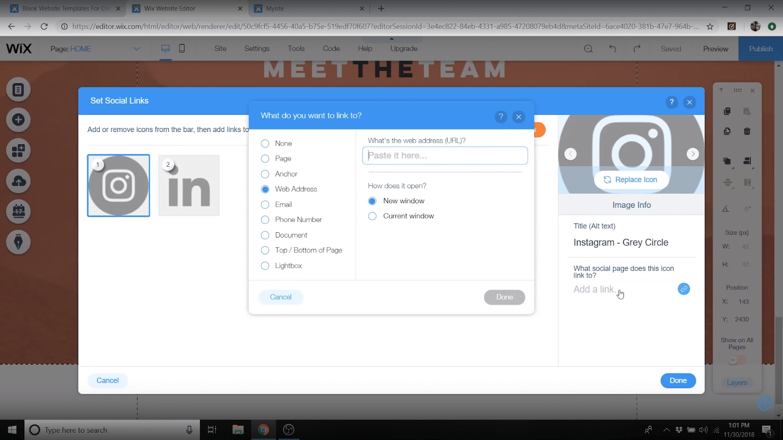
If you add social buttons on their own or as part of a section, you can change what social networks are shown and add the links to your accounts so people can follow you wherever they damn well please.
Just click on the social button you’ve added then click “set social links,” then you can click “add icons” to select free social media icons from Wix that match your site design.
From the icon selection menu, you can also add your profile links!
Adding forms
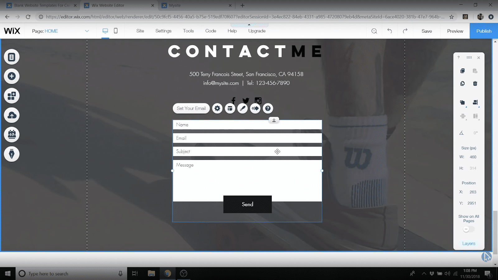
To add forms, again, see if you can find a strip with a form in it that you like, or just add a form to your site by itself from the “Add” menu.
Either way, be sure to click on the form once you’ve added it to your page, tap that “set email” button, and add your email in so that any submissions get sent to you.
(Quick side note: check out our how to get a professional email address post to see how you can go from “yourname@gmail.com” to “yourname@yourdomain.com” for FREE!)
Once you’ve added your email, you’ve also got tons of options for what form fields you want to have, what all the labels are, colors, etc.
Go nuts!
Add a header
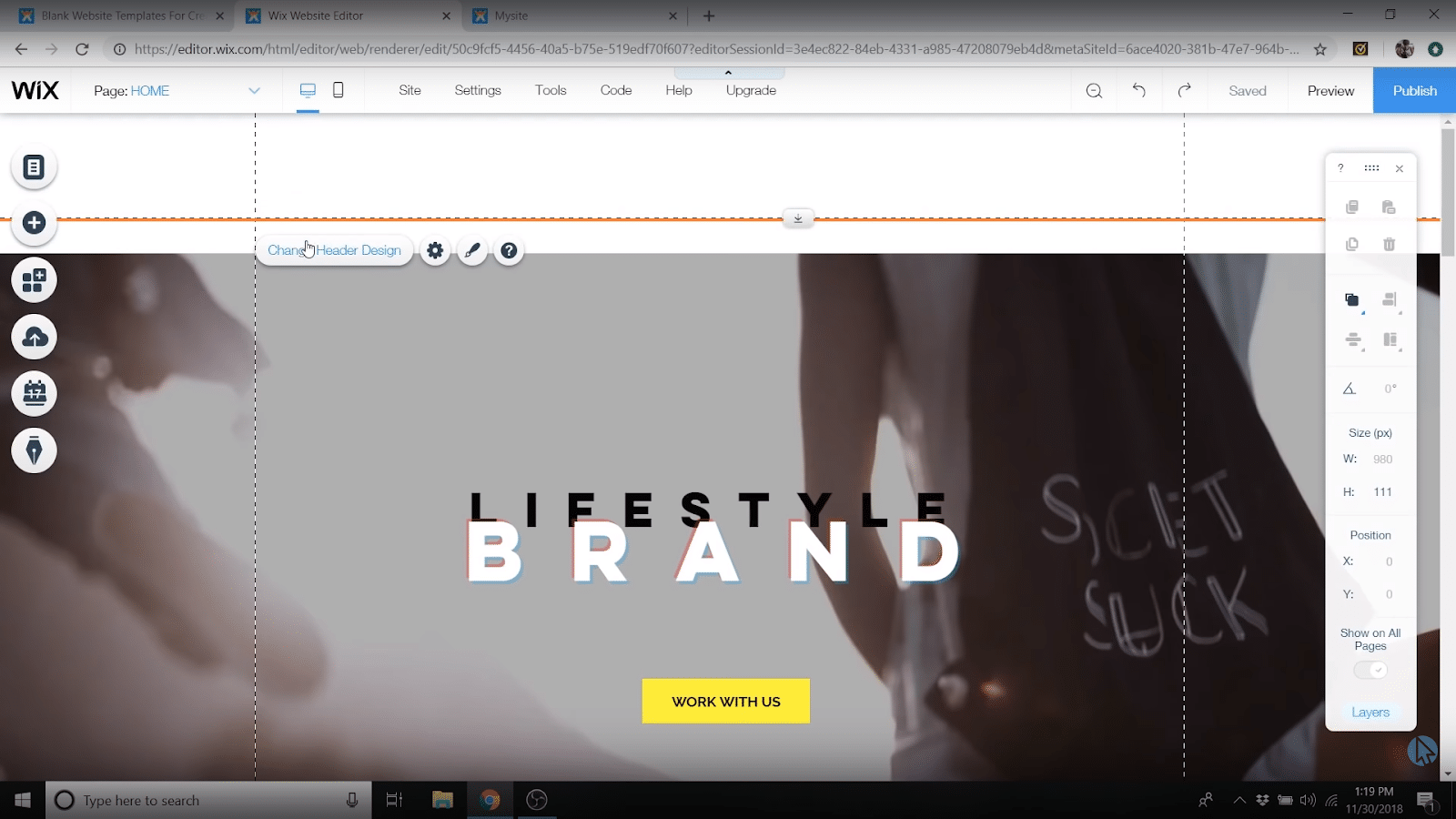
If you click that top/header area you’ll see it gets highlighted orange – just click on the “change header design” button that pops up to make changes.
You’ll have all the same options as the main part of your page – background colors, sizing, adding text, etc.
Adding menus
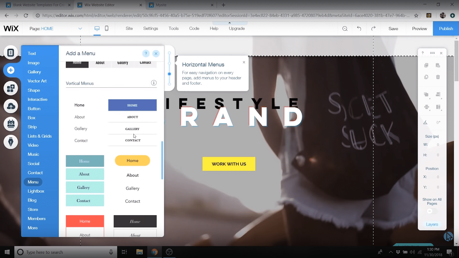
From that handy little “add” button, scroll down to “menu” and you’ll see there are a ton of presets to select from.
Drag and drop your favorite over to the header or anywhere else you want a navigation menu!
Adding your footer
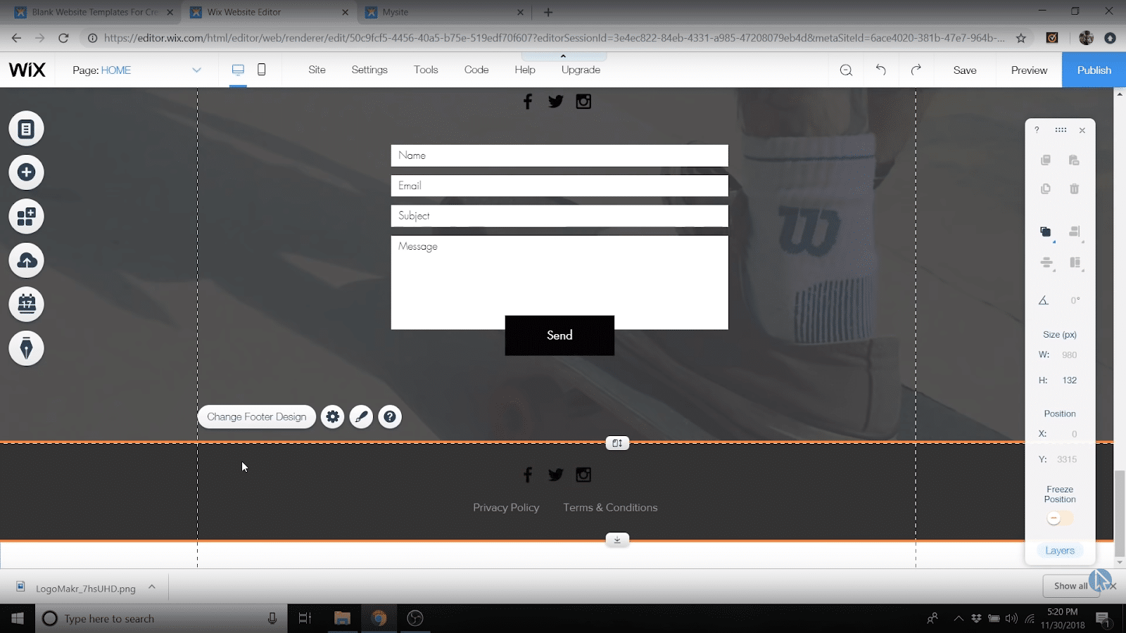
Last but definitely NOT least, the humble footer.
Just like the header, click on the bottom to see it highlighted orange, then click “edit” to make changes.
Common things to add here:
- Terms of Service page link
- Privacy Policy page link
- Copyright notice
- Social icons/contact info
Step 4: Upgrade to Premium and get your domain name
At this point, you’ve definitely created your own website with Wix!
BUT, she’s not a “pro” website.
Why?
Because Wix is going to add a “.Wixsite.com” to the end of your domain name and advertising for their service.
Not pro.
The good news is, it’s easy to fix that by upgrading your Wix plan and getting a custom domain name.

Wix
4.5/5


Ease-of-Use: 4/5

Customization: 5/5

Speed: 5/5

Support: 5/5

Price: 5/5
You’ll also get some other cool features like:
- More bandwidth to handle all the traffic your site gets
- More storage for any photos/videos you upload
- $$ in ad vouchers
- Sweet add-on apps that you normally have to pay extra for
PLUS, if you go with a 12-month plan, they’ll throw in a FREE DOMAIN NAME.
If all that sounds like a dream come true, head here to upgrade your plan now.
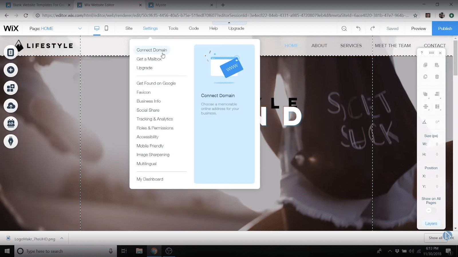
Then head back to your Wix website builder page, go up to settings, and just click on “connect domain.”
It’ll ask you if you want to buy a new one but since you already did that when you upgraded your plan, just click “connect a domain.”
Enter the one you just bought and Wix will set up the rest!
Building a website with Wix: FAQs
Which is the easiest website builder to create my own website with?
We really like Wix as it’s the best all-around website builder from a price, support, and customization standpoint.
It’s easy enough that we definitely feel good about recommending it to beginners, but the absolute easiest builder we found to use was Constant Contact, though it has way fewer features than Wix.
You can read our in-depth reports on both here!
Can I move from one website builder to another?
Is it at all possible? Yes.
But most website builders try to lock you in as much as possible, so there’s no easy way to export your website from, say Squarespace, and import it into Wix.
Start with Wix, though, and you’ll be in good shape 95% of the time.
How long will it take to build a website with Wix?
You can definitely get a pretty solid one page Wix website up and running in an hour (we show you how to do it in our Wix tutorial!!).
But, if you want lots of pages, a blog, an ecommerce website, or something super fancy, it can take you a lot longer than that.
Really, with websites, you can spend as much or as little time as you want building them!
What do I need to create a website with Wix?
Easy: just sign up for a free Wix account and you’ve got everything you need to get started.
If you want to remove their ads, get a custom domain name, and be able to handle a bunch of traffic, you’ve just got to upgrade to one of their paid plans (your website will stay up and running, nothing is lost when you upgrade!).
How much does it cost to make a website with Wix?
Wix paid plans start at just $13 for the combo plan we recommend!
Can you create a free Wix website?
Totally!
You’ll get all the basic tools, templates, and features you need to have a website live on the internet with a Wix free plan.
BUT if you want a pro site, that doesn’t crash from too much traffic, doesn’t have Wix ads, and uses your very own custom domain name, you’ll have to upgrade to a paid plan.

Wix
4.5/5


Ease-of-Use: 4/5

Customization: 5/5

Speed: 5/5

Support: 5/5

Price: 5/5
10 Reasons You NEED A Website
Nowadays, having an online presence is basically a must if you want to achieve your hopes and dreams.
Since you’re reading this guide, we’re pretty sure you agree.
But just in case you need a little extra motivation/inspiration, here are our 10 reasons why you even NEED a website in the first place:
- You can make a LOT of money. In fact, we know some internet millionaires who make all their money from websites.
- It’s an opportunity to be creative. If money isn’t what you’re looking for, that’s just fine because a website provides you with a creative space to show off your work, photos, and other artistic endeavors.
- It serves as an amazing resume. Want to stand out in your next job or find a better job? Having a professional website will put you head and shoulders ahead of everyone else on Linked In or for that next job interview.
- You can get a professional email address. Nothing really wrong with a good ole Gmail account, but the email dale@staging-createaprowebsite.com looks so much more official than dalenmcmanus@gmail.com. Right? This professionalism can help you in all sorts of ways from getting new clients to looking good talking to your bank about your mortgage.
- You can quit your 9-5 job if you turn it into an online business. Hate your job? Cool, so did we and that’s why we started building online businesses. Now we never have to go in for a 9-5 again!
- It’s an outlet to expand your growth on a hobby or topic. If you have a hobby or topic you already like, a website is an amazing way to grow you passion. Connect with others, write blog posts, document your experiences it can all be done with a website.
- You can become an influencer. You can HELP people learn new skills like DIY projects, how to cook healthy meals, automotive skills, etc. You can also help people reach their goals like losing weight, becoming a better gardener, being a better parent, etc.
- You don’t need expensive coding or technical skills anymore. Back in the olden days you’d have to be an internet wizard to build a website. Not anymore with today’s latest drag and drop technology!
- You don’t need to pay a pro $2000-$5,000 to build it for you. It’s actually incredibly cheap.
- Because we're going to help you do it right!
Remember, websites can be for whatever rhyme of reason. Let’s look at a few different types of websites you can create:
- Personal Websites (Lifestyle)
- Blog Website
- eCommerce Website
- Job Board
- Non-Profit Website
- Religious Website
- Portfolio Website
- Coupon Website
- Auction Website
- Podcasting Website
- Niche Website
- Affiliate Websites
- Photography Websites
- Videography Websites
- Private Blogs
- And so much more. Honestly, the possibilities are more limited to your imagination than anything else.
Designing and planning your new website
Until you start approaching master-chef levels, it's usually a good idea to start with a recipe.
Same thing goes with website building: once you get good, whip it up on the fly.
When you’re a beginner, maybe do a bit of planning work before you start dumping in the cayenne pepper.
We’ve got a big ole’ guide on how to design a website (including planning) you can check out here.
These are a few highlights:
Define your site’s purpose
That’s right, as with so much of life, your first step in designing your new website means answering the deep, fundamental question: why are you even building a website bro?
Fame? Fortune? Glory? All of it?
Whatever your reason for wanting to become a website maker, knowing what your goal is will help you figure out the planning and design end of things.
There’s so much to do and know when it comes to website creation, it’s super easy to get caught up in the weeds of it all.
This can be very fun. This can be very stressful.
But it can also lead you to never take that all-important step of smashing that Publish button and letting the world in on your little website secret.
Plus, if you don’t know what your website should do/be from the start, you can quickly do a little of this, a little of that, and end up with one manbearpig of a creation
This will be hilarious, yes. But it will be ineffective if you’ve got those fame/fortune/glory dreams.
So, are you wondering how to make a business website?
How to make a photography website?
Something else?
Here are a few zen master/Marcus Aurelius philosophical questions to ask yourself to get the creative juices flowing:
- Why do you even need a website?
- What would an “awesome/amazing/100” website look like to you?
- Who do you think your website is for?
- What will your website do for your visitors?
- How does your website idea compare to your competition?
- Do you want to make money? Share your thoughts? Information?
6 types of websites
To help you narrow down your website concept, there are a few different types of websites you can make.
Figuring out which one you’re going for will help you figure out what you’re going to need to build:
- Blog: A website where publishing news/informative articles on a particular topic (or a bunch of them) is the name of the game.
- Portfolio: A website where you showcase your work to your friends/family/potential clients.
- Brochure: A website that shares a bunch of information about a particular place or organization.
- Professional Services: A website that’s designed to sell services (maybe even website building) to clients and customers.
- Ecommerce: A website that sells physical or digital products.
Choose your initial branding
Once you’ve got some concept of what kind of site you want to build and why, it’s branding time.
Some companies spend millions to have giant teams of people do this for them.
So the possibilities are endless.
But we don’t need to get that fancy for now.
When it comes to “create my own website” types like you, branding basically means the colors and fonts you’ll use on your site.
Your logo too.
A lot of times you don’t have to think too hard on this because you can start with a website template that comes with certain font and color options.
Just go with those because there are literally people whose entire job is to pick the right fonts and colors for things and we don’t want you to waste too much time here!
That being said, having a bit of knowledge of how to choose good colors and fonts is helpful for making a site that’s fire.
Website color schemes
Color is a big part of the website designing game.
There's’ a ton of psychology behind what colors mean and how to use them effectively, but here are the basics of what colors mean:
- Black = luxury, power, elegance, and sophistication.
- Gray = simplicity, neutrality, logic, and “the future.”
- Red = urgency, excitement, danger, and passion.
- Pink = sweetness, femininity, innocence, and romance.
- Yellow = optimism, cheerfulness, and youth.
- Orange = creativity, friendliness, and enthusiasm.
- Purple = success, wisdom, wealth, and royalty.
- Green = health, wealth, peacefulness, and nature.
- Blue = security, stability, trust, and calmness.
Website fonts
Fonts are another big one in web design and branding.
There are literally millions of fonts out there so we can’t give you the whole list and tell you what to use them for.
But, here are a few of the main “families” of fonts and what they’re good for:
Serif (eg Times New Roman)
These are fonts that have small lines at the end of big strokes, like the \ of an A.
They make a website feel formal and organized.
Sans-serif (eg Arial)
Sans-serif fonts don’t have the lines at the end of big strokes, go figure.
They make a website feel modern and minimalistic.
Fantasy (e.g Lobster)
These fonts generally tend to be very fancy with lots of extra elements besides the basic lines needed to make characters.
They can be helpful for setting a very strong, particular vibe in your design (from v futuristic to v “ye olde”).
Monospace (eg Courier New)
All the letters in Monospace fonts use the same exact amount of horizontal space.
Because these fonts are consistent and letters/words are easy to distinguish, they give a website a very functional feel.
Cursive (eg Pacifico)
Cursive fonts look like cursive handwriting, with letters joined together in a flowing way.
This definitely makes a website look elegant AF.
The fonts in the Cursive family imitate human handwriting and the letters are usually joined together in a flowing manner. Many people associate Cursive fonts with faster writing and calligraphy.
A couple of other important website-font tips:
- Make sure the fonts you use are readable; every now and then you can get away with a cursive font in a header tag, but a page filled with cursive will quickly send people back to the dark and dank corners of Mrs. Hotlinger’s second grade class (aka “total confusion”).
- Only use 2 or 3 fonts on your site; a primary one (for headlines) and one or two secondary ones (for your subheadlines and body text).
Your initial website pages
As far as planning what content to include on your site goes, it really really depends on what your site’s purpose is and what information you’ll need to share to fulfill that purpose.
That being said, a few key pages just about any site will have include:
- Home
- About
- Contact
- Blog/Product/Service/Portfolio page(s)
Some general website design creation tips
With that super structured stuff out of the way, here are our last few random web design tips.
If you’re feeling the thirst for more how to design a website info, go check out our in-depth guide on this stuff here.
- Custom, eye-catching graphics and images are awesome; stock photos are fine to get started with, but you can and should get graphics/images no one else has if you can.
- Light or white background colors are generally best (though we’ll see if the Dark Mode trend starts to change that).
- Be sure to use the same color scheme and fonts across your site.
- Definitely make sure your site looks good on mobile.
- Make sure your headline/subheadline and navigation menus make sense.
- When in doubt, less is more.
Congratulations!
You're All Set To Publish.
If you’ve been following along step-by-step with this guide, then you should have a fully functioning website now!
Before you go, there’s another resource we want to show you that provides a ton of guidance for creating a website.
For some of you, the best move is to just start with the basics and start working on things yourself.
For others, this is going to be the best resource EVER for starting a website…
Introducing:
LAUNCH YOUR BLOG COURSE – How to Build and Launch with WordPress in 1 Month or Less, Without Any Coding or Being a Tech Wizard, Guaranteed!

It contains…
- WordPress Training
- Step-by-Step Designing Your Blog
- How to Create Beautiful Images
- How to Produce Amazing Content People Love
- Get Started With Email Marketing
- Setting Up Social Media
- And so, so much more!
It’s typically designed for bloggers but works all the same for people wanting to start a website. It shows you everything you need to know at the beginning and comes with tons of amazing training.
You can click here to check out the Launch Your Blog Course and get starting on the building phase!
If you enjoyed this article on how to create a website or have any questions, please feel free to leave them in the comment section below!
This post may contain affiliate links. Please read our disclosure for more info.


